Clibu Notes, Been awhile

At a guess this is the longest time between blog posts in many years. It has been a turbulent year for us all and our thoughts are with you, wherever in the world you may be.

Here in Victoria, Australia we had two long and hard lock downs last year. We couldn’t travel more than 5km from home, couldn’t see family and friends, and couldn’t do any of our normal activities like Gym and Golf. And we had to wear masks all the time outside the house. Having said that we’ve done incredibly well with very few community infections and deaths.

There weren’t many upsides to the pandemic, however it did mean lots more time working on Clibu Notes. Out of that has come considerable progress.

Clibu Notes has been designed with offline use and data privacy from the very start. Along with the ability to use it across devices, operating systems and Browsers. Unfortunately there is no getting away from the fact that full Offline use is hard. Different users working on the same Clibu Notes database can be offline for unknown amounts of time. When back on line the changes for all users must be synchronized amongst each other.

Collaboration is part of this picture as well, where several people can be editing the same document at the same time and their changes must be merged into one cohesive whole. This is further complicated when editing is done offline. The initial release of Clibu Notes is unlikely to include full collaborative editing.

There has been an explosion of Note Taking apps in the last year, which is pretty interesting to watch. Competition in any space is good, however one needs to be careful not to be distracted from your own goals. Adding features for features sake, making apps more complex to use, along with code bloat do not benefit anyone.

In these new apps Backlinks is an often touted feature that seems new, however our earlier application, Surfulater had two way ‘See Also’ links years ago. Clibu Notes does of course have back links. These are a bit of text anywhere in a note that links to another note and the other note has a backlink to the source. This is actually an improvement over the ‘See Also’ links in Surfulater. These links can also be used to create and link to a New Note, which is a feature found in some Wikis.

Most applications enclose these links in square brackets ex. [[Mercedes-Benz EQC]] which can be a distraction, whereas Clibu Notes shows pleasant clickable buttons Link buttonInbound links have a different background color. More on these links in a future post.

For Clibu Notes we are using a new text editor which is extremely powerful, but also complex to code for. It does however provide an incredibly rich set of capabilities, which enables us to do a lot of interesting things. Examples so far are backlinks, mentioned previously, todo lists and WYSIWYG markdown support.

We’ve recently changed both the front-end and back-end databases we are using in Clibu Notes. In the Browser this has improved and simplified some complex work flows. This work is currently ongoing.

The Clibu Notes User Interface continues to evolve. We’ve recently enabled side by side note panels. In other words you can see and work on two possibly related notes at once. The Tabs for Selected, Search, Viewed etc. have been removed as they complicated the user interface and duplicated tasks that can be done elsewhere.

After a way too long hiatus from Blogging I hope I’ve given everyone a good feel for the state of Clibu Notes development and look forward to posting regularly again.

As always we welcome your feedback. You can comment below or reach me at info@clibu.com

– Neville

Clibu Notes, Simpler, faster note taking, Part 1

Clibu Notes Alpha V0.42.00 has now been released. We’ve made considerable progress since the last release, both in what you see and what you don’t.

Clibu Notes functionality, user interface and overall attention to detail have all taken big steps forward since the last release.

We’ve added “Help” to get you going quickly and “About” which provides an overview of what’s available now and lays out a Roadmap outlining where we are heading.

Privacy and speed

Clibu Notes stores your notes privately on your device. Unlike most Web applications Clibu Notes does not need to query cloud servers located half a world away. This enables Clibu Notes to deliver a level of performance well above most cloud based applications.

For Clibu notes to synchronize your notes across your devices, we need to maintain a copy in the cloud, however this is encrypted so it continues to remain completely private. If you don’t need synchronization then you don’t need the cloud either.

Notes and Cards

Clibu Notes display their content in two varieties of cards. The first is a summary card, which includes the Note icon, title, date created & modified, number of times viewed and it’s ancestors (if any) in in the notes tree, which are termed breadcrumbs.

A click or tap on the note icon lets you change the icon and the title’s background color as show in the image below.

The other style of card displays the full note content along with rich editing capabilities.

This animated screenshot shows both types of Note card. Click on the image to enlarge.


A few things to notice in the screenshot

  • The date ‘Updated’ (date/time ago) is continuously updating.
  • Changing the icon or title background in either card updates them everywhere.
  • Clicking in the note editor switches it into edit mode. Click Ok or tap anywhere outside the note card editor stops editing.

The note editor card is either displayed beside the notes list or over the top of the notes grid – read on.

List and Grid views

Clibu Notes presents two ways to view selected Notes as shown here.
Click on the image to enlarge.

The List / Grid view toggle button changes views.

The currently selected note is highlighted via a change to its background color and shadow.

List view displays a single column of notes with an overview of their content. The selected note is open to view or edit to the right of the list.

Tap or click on a Notes Title opens it in the editor in view mode, whereas the Edit button opens it for editing.

To toggle Notes from view mode to edit mode, click anywhere on the notes editable content.

Grid view lays out the note cards in a grid. Clicking anywhere outside of the Note editor or on the Ok button closes the note editor.

In Conclusion

Our preview coverage of Clibu Notes will continue in Part 2, due out tomorrow. We have a much to discuss and a lot more to accomplish.

To be added to the evaluation list and get immediate access to Clibu Notes v0.42.00 simply email info@clibu.com

You can also follow us on Twitter.

As always we welcome your feedback and comments, either below, on our Support Center or via. email shown above.

Neville Franks, Author of Clibu Notes, Clibu etc. ©Soft As It Gets P/L 2020

Clibu v1.32.00 Release plus new Web Clipper – it must be Xmas Pt 2

For Part 1 which covers Clibu v1.32.00 see this post.

The Clibu Web Clipper has had a major update to add new functionality and bring it inline with Clibu.

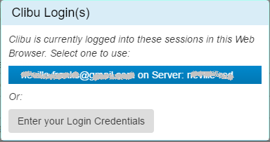
Whenever the Web Clipper needs to Login to a Clibu Server it looks to see if Clibu is open and logged in, in a Browser Tab in the same Web Browser as the Web Clipper. If so it displays this new dialog.

From here you can select from the list of Clibu sessions or Enter your Login Credentials.

This does two things. First it enables the Web Clipper to login without you having to enter any credentials and second it enables it to login into a Clibu Server other than the server at myclibu.com. More specifically this now enables users of Clibu ‘On Premise’ to use the Web Clipper with their Clibu Server.

If Clibu isn’t open and logged in you are prompted to enter your login credentials.

You can now enter the name of Knowledge Base you want to use with auto suggest simplifying selection.

Knowledge Bases that are shared with you include an icon beside their name as shown above.

Tags selection has been updated to the same user interface as in Clibu.

The Web Clipper uses native OS Desktop Notifications to keep you informed. We’ve updated these notifications to include more detailed information.

This example is the result of clicking ‘Add Article’ and includes the article title and the name of the Knowledge Base the article was added to.

Similarly the associated notifications in Clibu itself have been updated.

If you are new to the Clibu Web Clipper note that it can also be used from the Browser context menu.

If no content is selected on the Web page you get ‘Bookmark’ items on the Clibu sub-menu.

And when content is selected you can either create a New Clibu Article with it or append it to an existing article.

For more information on the Web Clipper see this post and this one.

In addition to the new features described above we’ve put considerable time and effort into developing a version of the Clibu Web Clipper for Mozilla Firefox and now have this working. I’ll write more about this in the next Blog post so stay tuned.

That’s it for this release of the Clibu Web Clipper. Just like Clibu we’ll keep on making it even better and welcome your suggestions.

– Neville

Clibu v1.32.00 Release plus new Web Clipper – it must be Xmas Pt 1

Well it has clearly been too long between Blog posts, in fact way too long. The good news is, this in no way reflects on Clibu development or releases. In fact it is simply because we’ve been so busy on development that allocating time for blogging has sadly not happened.

Our regular Clibu users will have seen we’ve had several releases since the last blog post and I’m sure are wondering what we’ve been up to, so let’s get to it.

V1.32.0.0 sees a long list of enhancements and new features and the Clibu Web Clipper has had a major update with new functionality. Let’s start with Clibu itself.

For a while now you’ve been asking for a quicker way to get back to seeing ‘All Articles’ once you’ve done a search. Our simple solution was to include an x button in search as shown here.

We’ve also rearranged the Tags Filter button so it stays in the same place after adding a filter. We’re also continuing to think about ways to somehow combine Search and Tags Filtering into one unified widget. If you have any suggestions we’d love to hear them.

Next we’ve added a ‘New Article’ button to the ‘Articles List’ header which brings it in line with the ‘New Tag’ and ‘New Knowledge Base’ buttons on their panels.

The Article editor has been updated with new capabilities including:-

‘Code Inline’ lets you style selected inline text as in this example:and is available on the editor toolbar Styles menu:Also note ‘Code’ has been renamed to ‘Code Block’.

The editor Styles button now reflects the style the cursor is on:

In this example the cursor is in a Quote. We’ve also improved the styling used for Quotes.

The new Horizontal Rule button adds, guess what, a horizontal rule.

The behaviour of the indent and outdent toolbar buttons has changed to only work inside lists. This fixes issues with the previous implementation and brings their behaviour into line with best practice.

The image above shows indent list disabled, even though we are inside a list. This is because the cursor is in the very first item in a list, which can’t be indented.

For the final editor toolbar improvement, we’ve made the buttons a little bit narrower, so more fit on a row.

Knowledge Base collaboration and sharing is the next area we’ve been working on. You can now Move articles to a Knowledge Base that is shared with you, as long as you have been granted full access by its owner. Similarly you can Merge a Knowledge Base of yours into a KB that is shared with you, given the appropriate permission.

We’ve updated all Clibu Web components, updated several third party libraries, further improved overall performance, optimised code both in the Browser and on the Server and fixed a variety of colorful bugs. For complete details see the Release Notes.

This post is long enough, so I’ll leave the Web Clipper enhancements to the next post.

As always we look forward to and welcome your feedback.

Neville

Clibu v1.30.40 Released – Install and run it on your PC/Server

Clibu v1.30.40 is another major milestone release for us.

Clibu running in the Cloud on our servers works wonderfully well for most folks, however we understand that not everyone wants this, instead they want to have their data stored privately on their own PC’s.

It was always a goal of ours to develop a product that would accomplish just this. So I’m excited to announce that starting with Clibu v1.30.40 you can now install and run Clibu entirely in house. We call this Clibu ‘On Premise’.

I’d planned and told people that this would be available back in March, however we had a major setback due to a third party shutting down a product we’d planned to use to build the ‘On Premise’ version. This forced us to go back to square one, and reevaluate the available options. In the end we did our own thing, as none of the contenders met all of our complex needs.

Clibu ‘On Premise’ is especially important in the business world, where data privacy is all the more important. And having it running entirely in house means you are in complete control, with minimal reliance on third parties.

To our knowledge there are no products that deliver the functionality that Clibu does, that can be installed on premise, which makes this release all the more exciting for us and for you.

If you’ve already requested access to Clibu ‘On Premise’ you will get an email with download details shortly. If not open a “New support ticket” in our Help Center to do so.

For details on getting up and running see: Clibu – Install and Run Locally

And finally we have full Release Notes.

Clibu V1.30.30, Rename, Merge and Delete Knowledge Bases and Move Articles

Clibu V1.30.30 is now up and running. This is yet another milestone release which sees Knowledge Base management capabilities completed.

The ability to Merge knowledge bases and move articles around from one knowledge base to another, provide the utmost flexibility and mean you aren’t locked into decisions which over time proved not quite as you’d like.

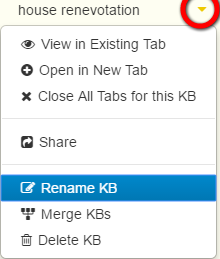
The Knowledge Base menu is opened by clicking on the down arrow beside each Knowledge Base name in the Knowledge Base Panel as shown here.

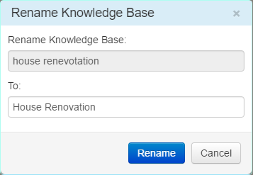
The first new feature in this release is Rename Knowledge Base.

You can rename any Knowledge Base that is owned by you, except the `Sample` Knowledge Base. You can’t rename KB’s that another user has shared with you. Instead ask them to rename them.

Next up is Merge KB.

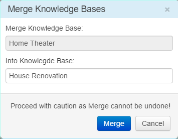
Merge lets you move all content (including Tags) from one Knowledge Base into another, deleting the source Knowledge Base in the process. Like Rename you can only merge  knowledge bases that you own, not ones that are shared with you.

Merge cannot be undone, so ensure this is what you want to do, before clicking on the Merge button.

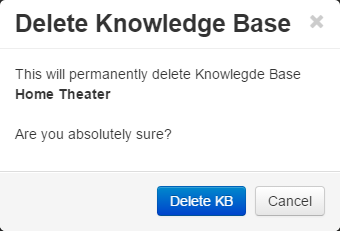
Delete KB is next.

This deletes all Knowledge Base content and cannot be undone, so proceed with caution.

The final new Knowledge Base management feature in this release is the ability to move articles from one Knowledge Base to another.

Start by selecting the article(s) you want to move by clicking their checkboxes in the Articles List panel. Then click the Move button highlighted below

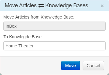
The Move Articles dialog opens next.

Select the To Knowledge Base and click Move. You can move articles from/to Knowledge Bases you own, but not from those shared with you.

Autosuggest is provided in both the Merge and Move Articles dialogs to simplify the process and robust error checks are in place everywhere.

The Merge and Delete KB processes can take a little while to complete, depending on the size of the knowledge bases. You can continue working normally and will be notified they finish.

Finally a big thankyou to Andy Brice (Hyperplan, Perfect Table Plan) for his help with Clibu usability testing. Andy made a video which was quite painful to watch and showed some glaring issues when Clibu was used on a narrow Browser window. I’ve addressed these and other issues Andy raised, in this release. From now on new users should get off to a better start with Clibu.

For everyone hanging out for the stand-alone, self installable version of Clibu,  it has been delayed due to extra time needed to finish this release, but shouldn’t be far away.

As always for complete release notes see here.

– Neville

Clibu V1.30.20 – Tag Creation Enhancements

Clibu V1.30.20 addresses some shortcomings with Tag Creation, streamlining its operation.

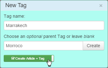
The “New Tag” and “New Child Tag” dialogs have been enhanced to enable you to create a new article containing the newly created tag.

Clicking on ‘Create Article + Tag’  toggles this option on and off.

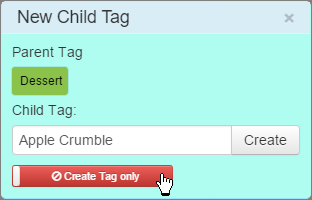
The ‘New Child Tag’ dialog shows it toggled off.

The setting for each dialog is retained locally across Clibu sessions.

The other change in this release is the newly created Tag is now selected in the “Tags Tree” and in the “Tags Filter”.  I’d previously decided not to change the current Tags Tree etc. selection, however after using Clibu for quite some time now I feel that selecting the new tag provides for a better user experience.

Full release notes are available in the Support Forum.

– Neville

Tags, Structured or Free Form, Hierarchical or Flat

There are a variety of choices when implementing Tagging systems, each with their own pros and cons.

Free form tags

Free form tags are created as you write. For example you might use a # character to signify a word is a tag. ex. #Christian Or you could use [] to identify multiple word tags, [Cars,Porsche].

The upside here is you are not interrupting the writing flow and they are quick to add. However, they have real downsides. The first is misspellings, so you are likely to have multiple variations of what should be exactly the same tag. Next, content captured from other sources, such as Web clippings, needs to be edited and tags placed somewhere. Finally, as tags are splattered throughout the content, you can’t see all tags in one place.

Managing and updating these free form tags is fraught, as you actually have to modify article content in order to do something simple like rename a tag (e.g. to fix a typo). Articles that are being edited will fall through the cracks as we can’t touch them.

Maintaining an index of which articles contain these embedded tags, along with their in-situ management, is a never ending task, which is expensive in terms of computer processing and performance.

Structured Tags

Structured tags sit beside article content vs. inside it as free form tags do. You add, edit and delete them outside of the article, so your workflow is impinged upon slightly, which may be viewed as a downside.

However, they have none of the drawbacks of free form tags. You never have inconsistent spellings of like tags, as they are easily checked when you add or edit them. They can be instantly renamed or removed without touching article content, regardless of what other users are doing at the time. They are all collected and visible in the one place and processing overhead is absolutely minimal.

Hierarchical Tags

Let’s say you are building a series of articles on Religion and you start adding a tag “Christian”. Then as your work progresses you want to tag articles of interest to your colleagues, one of whom is named “Christian”, woops.

Simplistic single level tagging can’t really help you much here. You could become creative and use “Religion.Christian”, although this falls short in so many ways.

Clibu has excellent Hierarchical Tag support, so this is easily handled. Simply add a tag “Religion” then move “Christian” below it. This happens instantly without having to update any articles. Next add a tag “Colleagues” and under that add a tag “Christian”, all done.

Some applications don’t allow you to use the same tag in multiple branches in the tag hierarchy (ex. Evernote(tm)). So the example above isn’t possible, which is extremely limiting. Clibu doesn’t have this restriction.

Hierarchical Tags as Folders

Everyone is used to Operating System folders, that’s where we store our files. Let’s look back at my earlier example of  tags “Religion / Christian” and “Colleagues/ Christian” and let’s say we have a document which relates directly to both of these. By and large OS folders let us down here as we can’t have the same document in multiple folders. (Power users may take exception at this.)

Back to Clibu. A document or article can have as many tags as you want, so this is akin to having the same document in multiple folders.

In fact, if it suits your way of thinking, simply treat  Clibu’s tags as folders.

Helping with Tag creation

Clibu helps you to pick existing tags via its autosuggestion capabilities. If the tag doesn’t exist, creating it is simple enough.

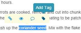
And there’s a nice tag adding shortcut you can use when editing content. Simply select the text you want for a tag, and then click on the tag icon on the floating toolbar.

If the text already exists somewhere in the tag hierarchy, pick the appropriate entry and it gets added.

If the text doesn’t already exist as a tag, you have the option to create a tag using it. Simple and saves time.

Analyzing article content and suggesting tags to add is, without doubt, a good idea and is something we are thinking about, along with some other interesting tagging ideas.

Tag tedium

Some people find adding tags cumbersome and not worth their effort. Instead they use Search to locate content. Others go back later on, after articles have been created and add the appropriate tags.  With Clibu you can work either way you choose.

I’m personally a heavy tags user, typically with multiple tags per article, several levels down in the hierarchy. To find specific content I use the Tags Filter much more often than Search, but hey, that’s just me.

I’m all tagged out, see you next time.

Neville

PS There will be some new Tag time savers in the next release. 🙂

Clibu V1.30.09, a major new release

A lot of work has been done since the last V1.20 release in Dec 2015. Unfortunately I’ve fallen behind in Blog posts and keeping the Clibu Release Notes up to date. I’ll work back and cover some of what we’ve done since the last Blog post in Oct , 2015.

As discussed in the past some folks want to have Clibu installed locally and also have their data stored locally. This was a goal we set out to achieve from the start. To accomplish this we needed to rework aspects of the Clibu code base to enable the entire application to be bundled into a single executable.

Much of the development these past few months has focused on just this. And we’ve gained other benefits to, such as the ability to use the latest Web Browser and language capabilities, along with a streamlined build process that enables us to release new versions faster, more reliably and with less effort.

These developments have gone extremely well. We now have a Windows .exe version of Clibu you can run on your own PC or Server. We’ll also have Linux and Mac versions available, covering all bases.

This is very exciting and is yet another capability that sets Clibu above and beyond similar products. We hope to start getting this out to users to try next month. If you’d like to be added to the list, open a Ticket at our Support Center or drop me an Email.

As part of this work we’ve dropped support for Internet Explorer. This enables us to use important new capabilities which are only available in the latest generation of Web Browsers, Microsoft Edge, Google Chrome, Firefox and Safari.

Back in Clibu V1.20 we updated the rich text editor used for Articles. This was another important update which resolved a number of issues, added some new features and gives us a better platform as we move forward.

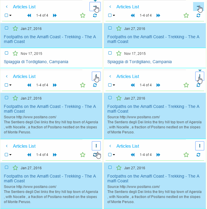
The Article List was also enhanced with a new Compact List view which is toggled as shown here.

The compact view lets you see more articles in the list at one time. And the < button at top left, provides a new way to close a panel.

For more information on this new version please see the Release Notes. You may notice there is a gap in the release notes and my blogging has dropped off somewhat. This is purely and simply because I’ve had my head down being super productive working on Clibu.

Some of the things planned in the near term, besides the local installable Clibu include:

  • The ability to delete a Knowledge Base
  • Move Articles between Knowledge Bases
  • Knowledge Base Export (downloadable backups)
  • Web Clipper Extensions for Firefox and MS Edge
  • Add Attachments
  • And work continues on full off-line support

Finally if you haven’t visited the Clibu Web site recently I’ve been doing some work on that and plan to do more.

Clibu V1 released, improved UI and easier to use

As soon as you open Clibu V1 you will see a much cleaner, easier and quicker to use, user interface. I was never happy with the original Clibu design which had bits modelled on Surfulater, however it failed to match Surfulaters ease of use in one area, and that was selecting a specific article.  This was because Surfulater included a list of article titles, which you could select from and Clibu didn’t. Clibu followed other aspects of Surfulater, such as displaying the full content of all matching articles.

To try and remedy these underlying issues I’d included the ability to collapse articles so you could browse through a list and select one. Then I added a second collapsed summary view so you could see more articles at once and finally I added a button that would hide all matching articles, except the current one. All the while none of this felt right, Clibu was getting clunkier to use, not easier and I was continually thinking something better was needed.

After much reflection and looking around at other apps, particularly on tablets and mobile where so much is happening now, I eventually came up with what you see in V1 and I have to say that for the first time I’m really pleased with how Clibu now works.

Clibu now consists of three collapsible panels and one fixed panel. These are as follows:

  • Knowledge Bases – Lets you select and open KB’s and lets you create a KB.
  • Tags – Displays the hierarchical Tags Tree where you can select a Tag to show only articles that match it, rename, move, create tags etc.
  • Article List – Displays a short overview of each matching article, and enables you to select the full article content, star the article, move it to trash etc.
  • Full Article – This displays an entire article, with full editing capabilities.

This animated screenshot shows the three panels collapsing and expanding.

The new button bar on the left enables you to collapse and expand each panel. Keyboard shortcuts are also available. The keyboard help button has moved to the bottom of the button bar (not shown here).

The + button in the Knowledge Base and Tags panels are used to create new KB’s and Tags. You’ll see several new icons and buttons in this release, hover over any one to see a tip about what it does.

Of course the Tab Bar is still present and lets you switch between the Knowledge Bases you have open. You will see the Tags Filter has moved up to to top navigation bar, alongside search.

As well as making Clibu easier to use I’ve taken this as an opportunity to freshen it’s look, with toolbars and icons that are softer and more subtle in appearance.

Another big step forward in V1 is that Clibu now works quite well on touch devices, in particular Tablets. So far most testing has been done using Chrome on Android and to a lesser extent Safari on iOS on iPad. There is still more we need to do, however it is really nice to be able to use Clibu on Tablets now.

Smaller screen smart phone support is still a work in progress. Needless to say squeezing an application like Clibu on to small screens and getting a touch user interface working effectively is challenging.

One thing to note re. touch in Clibu V1 is that you can now use a long touch for certain actions. A long touch on a button or icon displays a tip about what it does and a long touch on items with a drop-down menu opens the menu, for example on a Tag in the Tags Tree or on a Tab.

The new collapsible panel design and changes to the top navigation bar all tie in closely with making Clibu usable on Tablets etc.

In addition to the new user interface and look we’ve made some significant changes under the hood, which I’ll discuss in a future blog post.

In the meantime I hope you’ll find Clibu V1 an important step in making it your go to tool to collect and access information and look forward to your feedback.