
Following on from reviews by designers and from user feedback we’ve given the Clibu Notes user interface a thorough makeover.
It now has a simpler and much cleaner look. We’ve also moved some UI components off of the main screen to a new sidebar slide out panel.
This has free’d up space, making Clibu Notes easier to use on Smartphone’s.
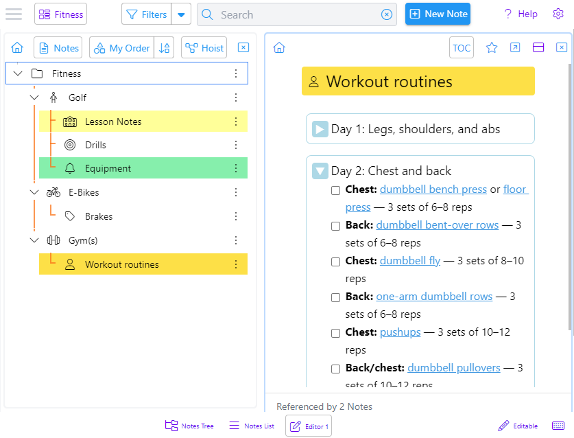
The screenshot above shows the Notes Tree and a note opened in an editor. Background colors have been removed and the active panel now has a highlighted border.
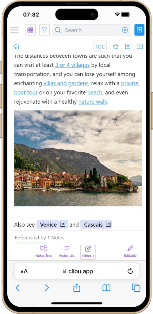
This is Clibu Notes V0.80.060 on an iPhone showing an editor panel.
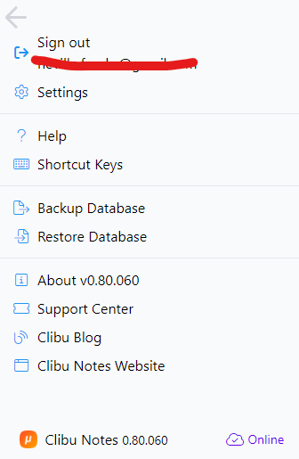
The new hamburger button opens this panel with items moved from the Settings menu and navigation bars.
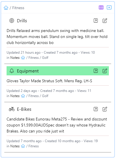
The notes list/grid also has a new cleaner look and now includes brief note content. Both it and the notes tree panel can now be closed and are reopened using the bottom navigation bar buttons.
Grid view is available on wider screens. The grid/list toggle button is hidden when grid view is not available.
In V0.80 we’ve started using a new styling (CSS) library. We’ve moved from a using ad hoc colors and styles to a standardized set. This is fundamental to the new look and feel. We’re most of the way there, but still have more to do.
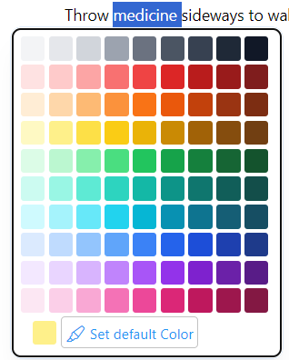
A related change is a new enhanced color picker with a much broader choice of colors.
In addition to all of these look and feel improvements we continue to fix issues we find and our users inform us about. And of course enhancements and new features are ongoing.
As you can see this is an important new Clibu Notes release and moves it closer to Version 1.
As always I look forward to your feedback.
– Neville info@clibu.com Follow us on X