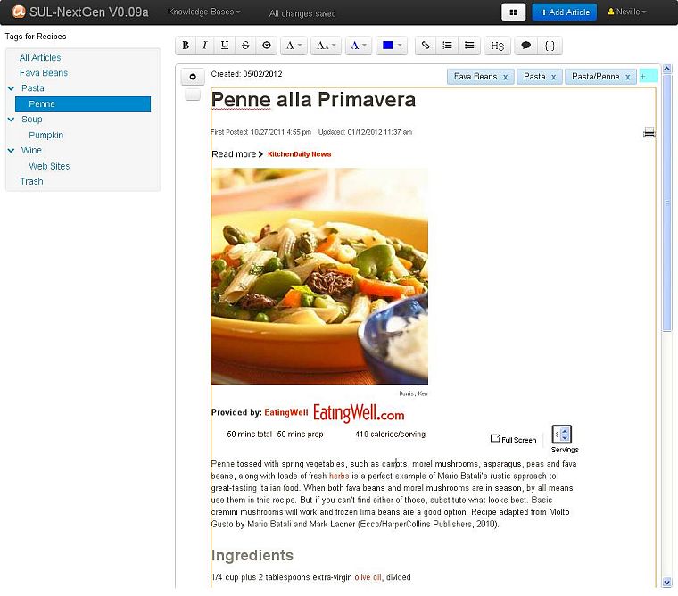
Moving on from Part 1 I want to show you some of the new applications user interface and discuss how it works and differs from Surfulater. Let’s start with a screen shot of the entire application.
On the left is the new hierarchical Tags Tree. The top Navigation Bar lets you select a Knowledge Base, change the content window view from summary to full-article view, Add an Article and perform actions for the current user. It also displays some status information.
The right pane is the content window. Various Buttons and Toolbars are displayed at the top, depending on whether you are editing content or operating on it. This screen shot shows the editing toolbar. Articles are displayed below this area.
At the top of each article is a button to toggle between showing the article in full or in summary and a button to select the article for bulk operations such as Move to Trash, Archive etc. Next comes Date created followed by the set of Tags for the article, followed by the articles content.
The separate Hierarchical Folder tree, Tags Tree and Chronological views have been replaced by a single new Tags Tree. Tags are hierarchical and can be as deep as you want. Tags can be edited, with changes reflected in all articles instantly. I’ll discuss tags further in Part 3 of this series.
Also note that the Tags tree no longer includes the articles associated with a tag. This drastically reduces tree clutter, making it quicker and easier to move around. The content pane shows all selected articles and the summary view effectively shows what the old tree did without the duplication.
The content window shows all articles for the selected tag in Chronological order. I may well add other sort options, such as alphabetic by article content.
To edit an article you simply click inside it, no more pencil click to switch into edit mode. And edits are saved automatically as you type.
I’ve tried to extract the essence of what is in Surfulater and simplify it as much as possible without sacrificing functionality. What you see here is the result of that pairing down to a much less cluttered, easier to approach and understand user interface. And most importantly a user interface that is very much at home on a touch based tablet device like an iPad as well as your Desktop PC.
Stay tuned for Part 3 where I’ll show you parts of the new user interface in more detail. Following that I’ll get onto some of the more exciting new capabilities.

