Clibu Notes, Fast Full Text Search. v0.45.00 Released

This Clibu Notes release continues laying the foundation for our simpler, faster, private, Note capture application. It includes important new capabilities such as fast full text search, a range of user interface changes based largely on user feedback and plenty of tweaks and bug fixes.

Fast full text search

Let’s start with Search. We’ve replaced the search engine used in Clibu, which unfortunately wasn’t as good as we’d liked.

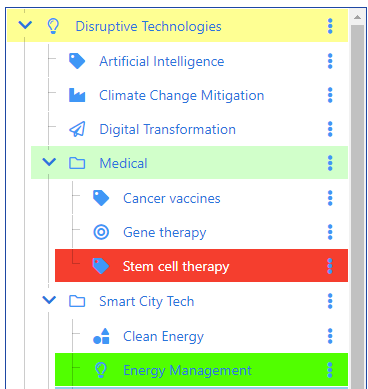
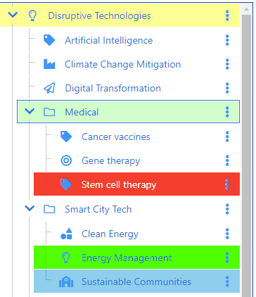
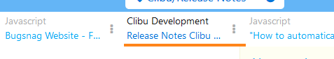
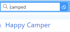
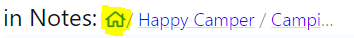
The search in Clibu Notes is lighting fast and includes fuzzy and partial matching along with word stemming. For example “camping” will find “Camper”, “Camping” etc. as will “camper”, “camp” etc. as shown below.

Search results are displayed instantly as you type, with no waiting to get data from the cloud. Search results are available in the Search Tab, so there is no need to redo a search. Results update when you select either the Search Tab or Search prompt, so they are always reflect reality.

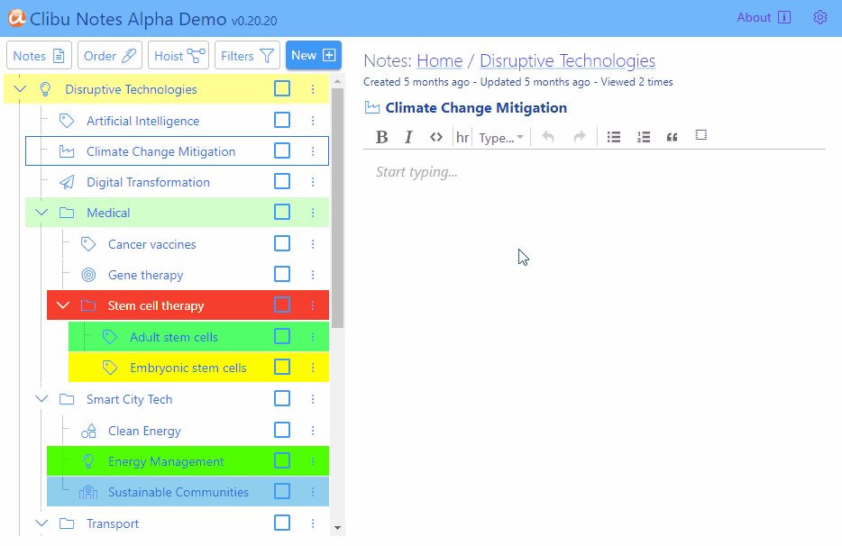
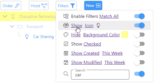
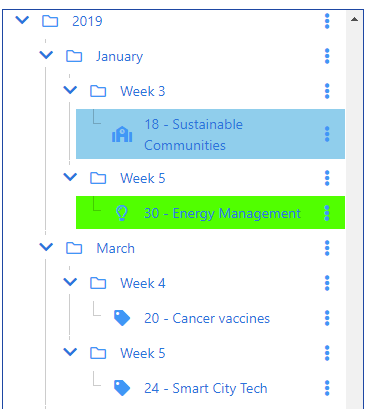
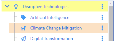
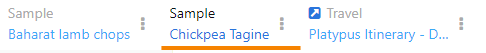
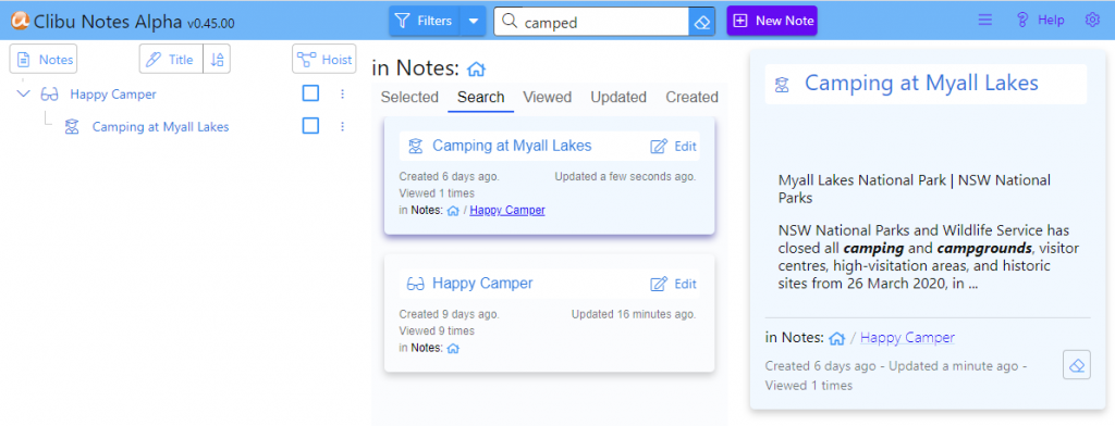
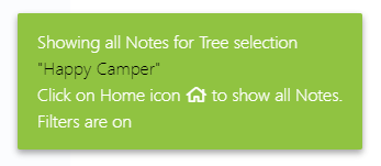
The Clibu Notes Tree, Notes List/Grid and Editor all update to include just the search results as shown here.

Search results will be highlighted in the Note editor in a future release.

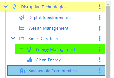
Selecting a note in the tree will show only the search results in that tree branch, letting you drill down to a subset of results. Click on the Home icon goes back to showing all search results.

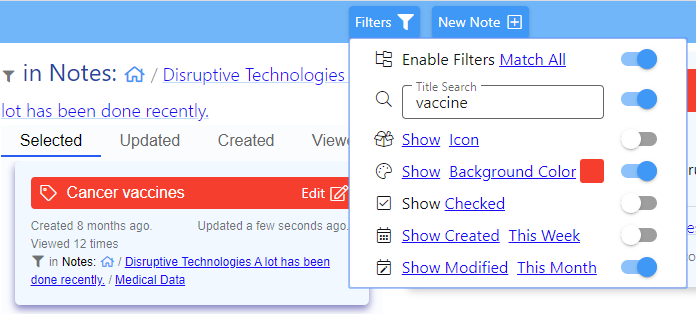
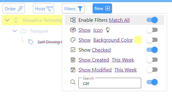
In a similar way, Filters can be used along with Search to home in on specific notes. For example you could show only search results with a green title or a certain icon.

Being independant

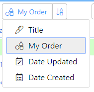
Every combination of View Group (Notes, Archive, Trash), Sort Type (Title, My Order, Date Updated,…) and List View Tab keeps its own set of Filters and Hoisting properties. This flexibility lets you have independant and specific sets of Notes displayed for each of these combinations.

When these change a notification is displayed summarizing what’s on view.

Streamlined user interface

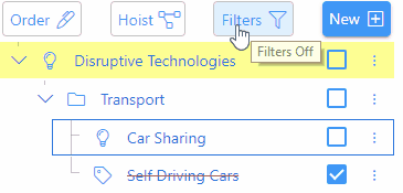
We’ve simplified and relabeled various user interface components in this release. Click/tap on the Filters button now toggles filters off/on and the dropdown arrow opens the filters menu. Changing any Filter setting now activates it’s filter and turns Filtering on. The New Note button is also more prominent.

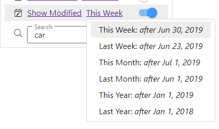
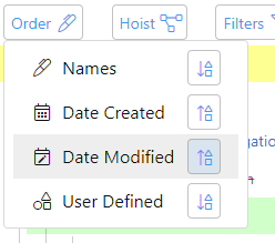
The Sort Order button and menu have also been changed. The button text and icon indicates the current sort order, which can be changed using the direction button on the right. We’ve removed the sort direction buttons from the menu itself, which were confusing.

That’s all for now

This release adds important new functionality, addresses a range of issues which weren’t working quite right and improves overall usability.

Next steps include major updates and added functionality to the Note editor along with work on the server to finish the multi-device synchronization. This builds on the current multi-tab synchronization currently in place.

The About page in Clibu Notes includes a roadmap I suggest you read. About can be accessed via Help or the Settings menu in Clibu Notes

As with earlier releases send an email to info@clibu.com to get access to this release. For continued early-release access we need your comments, criticisms and suggestions, so please do get in touch.

You can add comments below and open tickets in our Help desk, accessed via. the Settings menu in Clibu Notes. Or get in touch via email if you prefer. You can also follow us on Twitter.

Stay well, stay positive and be considerate to all around you.

Neville Franks, Author of Clibu Notes, Clibu etc. ©Soft As It Gets P/L 2020

Clibu Notes, Simpler, faster note taking, Part 2

If you haven’t read Part 1 yet, I suggest you do so first.

Seeing only what’s relevant

As you create more and more Notes it’s easy to get overwhelmed – you can’t see the wood for the tree’s. Filters remove the clutter, so you see only the notes that matter, for the task at hand.

For example let’s say you want to see only the notes updated in the last month, with a title color of red and whose title includes vaccine.
This screenshot shows how easy this is.

Title Search does a live fuzzy search on note titles. A tap on Show toggles each filter between show and hide. Show will only show notes that match the criteria, whereas Hide will hide them. Tap on Icon etc. lets you pick specific items from a menu. The switch to the right of each filter either enables or disables that filter.

Finally there is the Match All / Match Any toggle. Match All means notes must match all enabled filters, whereas Match Any means include notes that match any of the enabled filters. This has no effect if only a single filter is enabled.

For a more exhaustive demonstration click on the image below.


As Filters change, the Tree and Notes grid update to show only the notes that match the filter. Tree items which are filtered out but need to be displayed because they are ancestors of matching notes are displayed dimmed to identify this.

Keeping everything synchronized

The ability to update all copies of Clibu Notes as you add, edit and rearrange them, both efficiently and in real time,  has been a major undertaking and is a must have capability.

Pictures speak a thousand words, so without further ado. 
Click on the image to enlarge.


This shows Clibu Notes open in two Browser Tabs, positioned one above the other.

Editing is occuring in the top tab with the bottom tab updated in real time to match. Of course automatic content synchronization isn’t restricted to Tabs in the same Browser (except in this release).

Clibu Notes instances in any Browser on any device, anywhere, will be updated in exactly the same way, using exactly the same Clibu notes synchronization engine you see working above.

Taking this further you can continue using Clibu Notes even when you don’t have an Internet connection, including full editing, adding new notes, rearranging the notes tree etc. Then when you are next online, your changes and other online users changes will be synchronized with each other.

The ability to seamlessly access and work on your notes both offline and online is important to many of you and positions Clibu Notes at a level above similar applications.

In Conclusion

The About page in Clibu Notes includes a roadmap I suggest you read. About can be accessed via Help or the Settings menu in Clibu Notes

To be added to the evaluation list and get immediate access to Clibu Notes v0.42.00 simply email info@clibu.com

You can also follow us on Twitter.

As always we look forward to your suggestions and guidance.

You can add comments below and open tickets in our Help desk, accessed via. the Settings menu in Clibu Notes. Or get in touch via email if you prefer.

Neville Franks, Author of Clibu Notes, Clibu etc. ©Soft As It Gets P/L 2020

Clibu Notes, Simpler, faster note taking, Part 1

Clibu Notes Alpha V0.42.00 has now been released. We’ve made considerable progress since the last release, both in what you see and what you don’t.

Clibu Notes functionality, user interface and overall attention to detail have all taken big steps forward since the last release.

We’ve added “Help” to get you going quickly and “About” which provides an overview of what’s available now and lays out a Roadmap outlining where we are heading.

Privacy and speed

Clibu Notes stores your notes privately on your device. Unlike most Web applications Clibu Notes does not need to query cloud servers located half a world away. This enables Clibu Notes to deliver a level of performance well above most cloud based applications.

For Clibu notes to synchronize your notes across your devices, we need to maintain a copy in the cloud, however this is encrypted so it continues to remain completely private. If you don’t need synchronization then you don’t need the cloud either.

Notes and Cards

Clibu Notes display their content in two varieties of cards. The first is a summary card, which includes the Note icon, title, date created & modified, number of times viewed and it’s ancestors (if any) in in the notes tree, which are termed breadcrumbs.

A click or tap on the note icon lets you change the icon and the title’s background color as show in the image below.

The other style of card displays the full note content along with rich editing capabilities.

This animated screenshot shows both types of Note card. Click on the image to enlarge.


A few things to notice in the screenshot

  • The date ‘Updated’ (date/time ago) is continuously updating.
  • Changing the icon or title background in either card updates them everywhere.
  • Clicking in the note editor switches it into edit mode. Click Ok or tap anywhere outside the note card editor stops editing.

The note editor card is either displayed beside the notes list or over the top of the notes grid – read on.

List and Grid views

Clibu Notes presents two ways to view selected Notes as shown here.
Click on the image to enlarge.

The List / Grid view toggle button changes views.

The currently selected note is highlighted via a change to its background color and shadow.

List view displays a single column of notes with an overview of their content. The selected note is open to view or edit to the right of the list.

Tap or click on a Notes Title opens it in the editor in view mode, whereas the Edit button opens it for editing.

To toggle Notes from view mode to edit mode, click anywhere on the notes editable content.

Grid view lays out the note cards in a grid. Clicking anywhere outside of the Note editor or on the Ok button closes the note editor.

In Conclusion

Our preview coverage of Clibu Notes will continue in Part 2, due out tomorrow. We have a much to discuss and a lot more to accomplish.

To be added to the evaluation list and get immediate access to Clibu Notes v0.42.00 simply email info@clibu.com

You can also follow us on Twitter.

As always we welcome your feedback and comments, either below, on our Support Center or via. email shown above.

Neville Franks, Author of Clibu Notes, Clibu etc. ©Soft As It Gets P/L 2020

Clibu Notes Alpha Demo Release v0.20.21

I’m excited to release another major milestone version of Clibu Notes. This version continues the complete rewrite and redesign of Clibu based on your feedback and use cases. It also brings back some of the sought after capabilities of Clibu’s predecessor, Surfulater. In particular a Folder tree with Notes, selectable icons and background colors, full drag and drop, sorting, date views, filters, user controlled tree item ordering and archive and trash groups.

The user interface is being redesigned to deliver a more streamlined experience with less clutter and be more visually appealing. This screenshot will give an idea of where we are heading, although changes are highly likely.  Icons and labels assist with identifying context. Of course we have a live demo (link below) you can play with.

Another major update is a new and far more capable and robust rich text editor.  At present only basic editing capabilities have been included. To follow we’ll deliver Markdown support, Tables, Checkbox items and more. The overall editing experience will be much improved.

The new Home content panel gives quick access to Recently Updated, Recently Created and Most Viewed notes.

You can quickly move between Note content/editing and Home.

Also new in this release are Notes, Archive and Trash groups. Notes can be freely moved between groups. Home content is specific to the selected group.

In Archive and Trash groups, ancestor Notes which are in a different group are displayed dimmed and Notes in the selected group show either the Archive or Trash icon. Notes can’t be edited in Archive or Trash groups. Empty Trash is coming.

Clibu Notes stores everything locally in a database in your Web Browser ensuring complete data privacy and fast data access. Import and Export/Backup will be available.

We plan to deliver full offline capabilities where you can continue working without an Internet connection. Much needed when you are on a plane, train or just getting away.

We’ll also offer optional real time synchronization across devices as Clibu provides now, along with synchronizing changes when offline devices come back online.

Noteworthy in this release is the addition of Note URLs in the Browser Address Bar. You can use these URLs to open Notes from other within applications or by pasting them into the Browser address bar.

For additional application information click the “About [i]” button in the Demo app.

Other items on our roadmap include:

New full text search engine
Tags with drag & drop
See Also cross reference links, with drag & drop
Attachments and Image support
Drag and Drop everywhere
Tablet and Smartphone support
User activity tracking and permissions
Document versioning
Collaborative editing
Content Sharing and publishing
Import/Export and Backup
Your suggestions

In earlier posts we’ve showed Hoisting, Filters, Tree drag and drop etc. These are recommended reading – see: Sample Clibu ToDo App with our new Tree and Unveiling our new Clibu Tree Widget

You can play with the new Clibu Notes Demo here. As I mentioned above, all data is stored locally in your Browser.

The Settings menu lets you remove the demo content and add it again. Certain demo content is created at random, for example date created and Note text.

Please let me know your thoughts on this early alpha release of Clibu Notes and help us guide it, to best meet your needs.

– Neville

Sample Clibu ToDo App with our new Tree

The second release of our new Tree Widget is now online with more new capabilities demonstrated via. a sample ToDo Application.

The UI has been further refined and now adheres to the W3C Web Accessibility Guidelines.

Tree Filters are the number one addition in this release.

Filters enable you to see and work with specific sets of tree items. In the example above only items that include the word car and whose checkbox is checked are displayed.

Ascendant items which don’t match the filter are also displayed, however they are dimmed to visually differentiate them.  You can filter by any or all of the items displayed in the screen shot by clicking on Match All.

Icon, Background Color, Date Created and Date Modified can inverted to Hide items that match, as shown here.

Date Created and Date Modified filters enable you to select from various date ranges.

The Filter button icon changes to a solid color when filters are on.

A long press on the filter button is an alternative to using the Filters menu to toggle filters off/on as shown above.

Another new feature in this release are tree item checkboxes. When checked the text changes to strikethrough. Any descendants also toggle their checkbox state. The Show Checked/Unchecked filter shows or hides checked items.

Next we’ve enhanced the Order menu to enable each view to have its own independent sort order.

Taping the sort button reverses the order for that view.

When Hoisting is active the Hoist button icon changes to a solid color and the tree background color changes.

The palette of icons has increased in this release and all icons have been changed to a lighter outline.

The icon for the selected tree item is highlighted menu the icon picker opens. Likewise for the color picker.

Finally the Settings menu has been added.

The last two menu items are only shown when the application is in debug mode.

As part of the work on accessibility, we’ve implemented comprehensive keyboard support, which also conforms to the accessibility guidelines.

For example the cursor arrow keys navigate the tree and all menus. Tab and Shift Tab move within tree and menu items setting focus on user interface elements, to enable further actions to be taken. Space toggles a checkbox, switch etc., Enter opens a menu associated with a button and Esc works back through previous user interface elements.

I’ve been quite surprised at how poorly most Web applications implement real keyboard support and their lack of accessibility support.

This release, like the previous release, stores all data in a database in your Browser. In the future we’ll include data synchronization across devices and full offline support.

And of course we’ll deliver an application that works on Smartphones, Tablets and the Desktop.

Unveiling our new Clibu Tree Widget

One particular area in Clibu that I’ve not been satisfied with is the Tags Tree, which lacked functionality and was even a step backwards from Clibu’s predecessor, Surfulater. It has shortcomings which make working with the tree more difficult than it need be and it is missing niceties which enhance its usefulness.

So I went back to square one, specified all the requirements I felt were both mandatory and also the ones that would improve its overall usability.  At the same time I took this as an opportunity to reevaluate the underlying code libraries I’d developed Clibu with, as so much has not only changed, but greatly improved in the last few short years.

This has been a terrific experience, one which Clibu and its users will definitely benefit from. Further, this explains why you haven’t seen any new Clibu releases in a little while, nor any activity here on the Blog.

Without further ado let’s run through the new and improved Clibu Tree Widget. First a couple of screenshots. All images are of the same tree content.

Multiple Tree Views

This is the Name View.

This is the Date Created View.

New capabilities

  • Multiple tree views give you different insights:
    • Order by Name (the current Clibu view)
    • Order by Date Created (tree displays, year, month, week, day – tree item(s))
    • Order by Date Modified (tree displays, year, month, week, day – tree item(s))
    • Used defined order. Lets you order siblings (items at the same tree level)  however you want.
  • Rearrange the tree using drag and drop.
  • Sort the current view ascending/descending.
  • Used selectable Tree Icons – displayed to the left of the tree item name.
  • Ability to select the background color for each tree row.
  • Tree item hoisting. Enables any tree item to become the root or top-level item in the tree.
  • Optional Tree lines – for easier tree visualization.
  • Expand/Collapse all descendants.
  • Branch Expand/Collapse state persists across sessions.

Drag and Drop

The ability to rearrange the tree using drag and drop is one of the big improvements, along with different views of the tree.

As you drag a tree item it’s background color changes to green when it can be dropped. If it can’t be dropped a notification is displayed underneath it explaining the reason why as shown here.

When dropping in between items an arrowed line shows the drop location. It is green when the drop is valid and grey when it isn’t.

One view of special note is where you can arrange tree items in any order you want, not just sorted by name.

This shows moving ‘Sustainable Communities’ before ‘Energy Management’. In the Demo this is the byUserDefined view. Switching back to the byName view will display the tree sorted in name order.

Tree Hoisting

Next we’ve added Tree Hoisting which changes the view to show only the selected tree item along with all of its descendants. Hoisting enables you to work on a subset of the tree, in isolation from the tree as a whole.

The Hoist switch instantly toggles back and forth between the hoisted view and the full tree view.

Sort Order

Continuing with tree views is the ability to sort the tree either in ascending or descending order. This works for all tree views.

Highlighting Tree Items

To make specific tree items more prominent you can set their background color and icon.

Etc.

Other nice features include the ability to display tree lines which make it easier to see the shape of the tree. Expand and collapse entire branches with the expand/collapse state maintained independently for each view and retained across sessions.

Demonstration App

We’ve put together a Demonstration app for you to play with. All data is stored in a database in your Browser. There are Demo usage instructions on the app web page.

The Debug checkbox enables us to view any issues that may occur along with some of the app’s inner workings. If an error occurs two additional panels will be displayed, one showing the database and the other the tree. Please send us a screenshot if these are displayed.

The end or just the beginning

The new tree delivers important functionality which will help streamline your use of Clibu. Functionality we’ve developed for the tree, like drag and drop, will over time be incorporated into more parts of Clibu as our journey of continual improvement unfolds.

I hope you like what you see and as always your feedback is greatly appreciated. Please use the comments section below for all feedback including any bug reports.

Clibu V2.01.00 Improved color picker, Tab drag & drop, new article styling …

Today we’ve released Clibu V2.01.00 with some nice new UI enhancements and improved article look and feel.

The text and highlight color pickers have been updated with more colors along with a better choice of colors for each task.

We’ve also made it quicker and easier to highlight text by splitting the buttons in two. Clicking on the left part of the button uses the current color on the selected text and clicking on the drop-down arrow lets you choose a color from the color picker.

The updates to the Color picker are important and will enable us to use it in other areas, such as setting Tags tree item colors etc.

When you have lots of Knowledge Bases open, arranging their Tabs in a specific order can be very useful. To accomplish this hold the mouse or your finger (on touch devices) down on the Tab menu icon and drag the Tab to the new location, then release it.

You will also see that we’ve changed the styling of article text along with a change to the default font. Headings styles are the main improvement, giving articles a much more modern look and feel.

Keyboard Help is back. Press Shift+? or click on the Keyboard button on the icon sidebar.

The indicator which displays when an article is loading has been updated to an animated bar, which is less intrusive and looks way better.

An issue with Knowledge Base Sharing Permissions has been fixed enabling them to be changed again.

The Clibu Web Clipper was updated in the last release, which we didn’t blog about at the time.

As always we welcome and look forward to your feedback.

– Neville


Clibu V2.00.20 Released, Performance improvements etc.

In today’s Clibu V2.00.20 release you will see Articles display more quickly following an extensive rewrite of the code that handles article display. This affects both the Article and Articles List panels.

Whenever you do a query, we now start by displaying the full Article first and then follow this by updating the Articles List. We also retrieve all the articles for the current page of ‘articles list results’ in one batch, whereas previously we retrieved them in sequence, one after the other.

Going to any Page of results in the Articles List is quicker now.

Prior to this release, the articles list could display an article from the wrong page, when you scrolled rapidly through a large number of articles, using Ctrl+Up/Dn Arrow. This has also been addressed in the rewrite.

We continue to improve Clibu’s usability by minimizing changes to what you see and are working with, when articles are moved to or from Trash or to another Knowledge Base. These include articles moved by another user. In essence we try and maintain the current Articles List and Article views to reduce the impact on your workflow.

We’ll be addressing this further in the case of adding articles, whether by you or another user, via the Web Clipper or Email, in a future release.

The ‘On Premise’ version of Clibu has also been brought up to date and a new release is now available. Contact us though the Help & Support Center for details.

For a full list of changes see the Release Notes.

– Neville


New Article Tags menu, enhanced Tabs and more in Clibu V2.00.19

Time got away from us, causing us to miss Blog posts for Clibu V2.00.15 and V2.00.16 which were both released back in March. Both were primarily fixes for various small issues. V2.00.17 and 2.00.18 were internal releases and here we are now with V2.00.19 with a longish list of updates.

New in this release is the Article Tags menu, which opens when you click/tap on a Tag in an article, as shown here.

This new menu speeds up workflow when working with tags. What’s important to note here is that all menu items except Add Tag to Article and Remove Article Tag operate on the selected tag component . So when you click on the Recipes tag, ‘Query’ will run a query on ‘Recipes’ and when you click on Middle Eastern, then Recipes is also selected and the query would be ‘Recipes/Middle Eastern’.

This is a first step in a range of enhancements to make using tags both quicker and easier.

Until now using Knowledge Base Tabs could be a little frustrating, especially when the same KB was open in multiple Tabs. Because you had no idea what the actual content for a Tab was, you were forced to click each Tab until you found the one you wanted.

In this release we’ve enhanced Tabs to include the beginning of the current Articles Title in each Tab, as shown here.

This makes it so much easier to jump straight to the Tab you actually want.

As part of this enhancement we’ve reduced the size of the tab text font and set a maximum tab width, so that more tabs are visible, reducing the need to scroll tabs. The Tab dropdown menu icon has also changed.

Next we’ve updated the Articles List behaviour, so that whenever possible the current list remains unchanged. For example if you click/tap on a ‘See Also’ article link and the target article is in the articles list for the target Tab, the list will stay as is. Previously it would cleared and then include only the target article. By retaining the current context this further improves your workflow.

As part of the Smartphone and Tablet updates we got a little to clever when we managed to get our article content selection toolbar to replace the a native Copy, Paste toolbar. In doing so we prevented Paste from being used.

So in this release the native selection toolbar is displayed where you tap and the Clibu selection toolbar is displayed at the top right corner of the article, so that it can still be used.


There is a substantial list of smaller updates, enhancements and bug fixes which you can see in the Release Notes.  One I want to mention is that you should notice articles with images display faster in this release.

In the release notes for V2.00.16 I mentioned that Clibu’s error reporting has had a major update. This has proven very helpful in helping us pinpoint and fix obscure problems as we continue to improve the overall quality of the Clibu code base.

There is plenty more going on behind the scenes, however I’ll leave that for a future blog post.

– Neville

Navigate around Articles with the new Table of Contents in Clibu V2.00.14

Another shiny new Clibu update has been released. The main new feature in V2.00.14 is the ability to access a Table of Contents for each Article, select an item and position to it.

Articles can get quite long and finding what you want inside them can be more difficult than it should be. This is where the Table of Contents (TOC) is very, very useful.

When you click/tap on the new TOC button the current article is scanned and all content that is formatted as headings is gathered and displayed in a drop down menu as shown here.

Note that the numbers 1-10 in this example are in the actual article headings.

Selecting a TOC item scrolls it into view and briefly highlights it, making moving around articles much quicker. Whilst editing the cursor is positioned at the end of the selected item.

When you open Clibu it now restores the current Article to the last article you viewed in each Tab in the previous session. This is in addition to restoring and running the last query.  So you start back exactly where you last left off.

This is something I’ve personally been wanting for a while now. It is all about workflows and getting back in the zone as effortlessly as possible.

Various issues with Clibu’s Annotations (pop up Notes) which crept into V2 have been fixed along with a few illusive, hard to track down and annoying bugs.

See the complete Release Notes for details. which you can also access from the Clibu User Menu.

– Neville