
Continued from Part 1
I want to start with a small rant. One fairly common user interface action that irks me is having to hover over an area to reveal a hidden icon which you then tap/click to reveal a toolbar or menu. I don’t know about you but I find this awkward at best.
You randomly move your mouse around and out of the blue some icon appears and if you don’t stop at just the right moment it disappears again.
It gets even worse on touch screen devices, like your smartphone, which have no concept of mouse hover. So the designers/developers have to come up with others ways of enabling the user to perform the actions that are behind these hidden icons.
The end result is a different user experience and user interface for the very same application across different devices. Rant over.
Creatively, A publication about creativity and productivity-boosting tools.
Philipp Temmel writes a fantastic weekly newsletter named Creatively which I can highly recommend. As I’ve said to Philipp I don’t know how he is able to produce such high quality, insightful content on a weekly basis.
Creatively issue 243 is what prompted to write these two articles. My plan was to write a short intro and then with Philipp’s permission, republish the opening part of issue 243. However as I started writing Part 1 I couldn’t stop, so here we are now with Part 2.
And now with Philip’s permission the excerpt I mentioned.
Hey and welcome to Creatively 243
Hey and welcome to Creatively 243
I am observing a trend I am following unconsciously. Over the course of the last couple of months, I simplified loads of my workflows. Based on that, I also started using new tools, got rid of some I used previously, and explored different integrations. While it all was exciting when note-taking and PKM tools introduced “self-organizing by AI” and everyone screamed at me that I do not need to use folders, tags, or anything else, it is simplicity for me to organize my notes freely, following a simple system, knowing where I can find stuff if I am looking for it. As we are evolving Scrintal, introducing new features and functionalities, we want to be sure that everyone can get started taking notes, building up a knowledge base, and managing projects. There should be no need to take a course, read through docs, guides, or tutorials. If you have a dedicated system, you should be able to apply it, but if you have no system that should not hinder you from starting out.
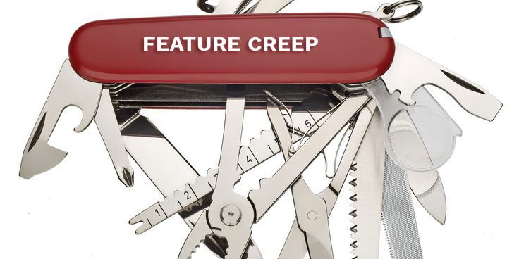
Nowadays, there are loads of note-taking, PKM, and productivity tools which are forcing systems on you. As those apps get packed and bloated with features, the simplicity gets lost. Back in the day, taking notes was as easy as grabbing a pen and paper. You could jot down anything you wanted, whether it was a to-do list, an important meeting point, or just a random thought that popped into your head. It was simple, effective, and didn’t require a computer science degree to figure out. But then technology came along and disrupted everything. Suddenly, there were all these fancy note-taking apps that promised to revolutionize our lives. And sure, they did bring some cool features to the table. You could now organize your notes in different categories, add tags, and even sync everything across devices. It was like having a personal assistant in your pocket.
But here’s the thing: these apps got so caught up in trying to be the best, they forgot about the one thing that truly mattered – simplicity. They became bloated with unnecessary features, confusing menus, and an absurd number of customization options. Suddenly, taking a simple note turned into a complicated task that required a user manual. The same thing happened with PKM apps. They started off as a promising way to manage our personal knowledge, allowing us to store articles, links, and ideas in one place. It was like having an external brain to rely on. But then the developers decided to throw in a bunch of additional features – smart filters, complex search algorithms, and even machine learning. Suddenly, managing our knowledge became a PhD-level task.
And don’t even get me started on productivity apps. They used to be all about helping us stay organized and get things done. But now they bombard us with notifications, reminders, and all sorts of time-tracking features. It’s like they’re constantly breathing down our necks, making us feel guilty for not being productive every second of the day.
As of recently, I have the feeling that simplicity is making a comeback. Users are starting to realize that they don’t need all these complicated apps to be productive. They’re looking for tools that are intuitive, easy to use, and don’t require a steep learning curve. In the end, simplicity is not about dumbing things down or removing features. It’s about understanding what truly makes a tool useful and optimizing it for a seamless user experience.
This really resonates with me and the landscape I see. I encourage you to visit Creatively and Sign Up for the newsletter.
That’s it until next time.
Neville
One Reply to “Why are so many apps so complex – Part 2”
Comments are closed.