Collaborate with friends, family and colleagues

The latest release of Clibu Notes V0.83.020, enables you share specific sets of notes with other people. You can control whether they have full editing rights or can only view the shared content.

When you create a Share you are given a special link which you send to the people you want to sharing with. They do not even need to be registered Clibu Notes users.

Real time collaborative editing

Clibu Notes enables multiple users to edit the exact same notes at the same time. All changes coalesce, so everyone eventually sees the exact same content.

This goes even further enabling changes made by users who are offline to become consistent when they next come online.

This collaboration extends across all aspects of Clibu Notes. For example drag & drop of notes in the Notes Tree, changing note icons, title colors etc.

Automagic Content Synchronization

One way or another most PKM / Note Taking applications enable you to synchronize content. Often though, they do not enable collaboration. This quickly leads to notes overwriting each other and loss of content.

It can get even worse where the application relies on copying files from one device to another in order to synchronize. And if you forget to do this or can’t, well too bad. You then have content which may never become consistent.

With Clibu Notes you never, ever need to worry about content loss or inconsistency. The entire process is seamless and invisible to our users. As I’ve stated in several places, this is truly magically liberating.

For anyone technically interested in how this magic occurs Google CRDTs.

Our recent 4 day road trip

An excellent example of the joy this brings is a recent 4 day road trip we did. With me is a Windows Laptop, Android Tablet, Chromebook Tablet and an Android phone. Along the way I was making notes of places we’d visited, cafes and restaurants we’d go back to etc. These would be taken on the Tablets and Phone.

Internet access was often non-existent for long stretches or patchy at best, but this made absolutely no difference to my use of Clibu Notes. As soon as any of my devices came back online all content changes resolved and became consistent. When I turned my Windows Laptop on of a night it updated with the changes from the tablets and phone.

If others had been using a Share they also would have been updated.

The bottom line is it “just works’ and it is truly magically liberating knowing all of your content on all of your devices is either up to date or will be when they come online. Without any user intervention!

Details in the Clibu Notes Help

For full details on Clibu Notes Collaborative Sharing open clibu.app, select Help – F1 and the open the Collaborative Sharing note.

To Finish

Clibu Notes has had full collaboration from its inception, however implementing Sharing in V0.83.020 was a complex task. We needed to ensure it was robust and capable of being enhanced as needed in the future. I’m pleased to say we’ve met these goals.

Now that Sharing is ready for mainstream use we’ll get back to more frequent releases again. The next release is very close.

Thanks for reading – Neville

More new releases, more improvements

On average we’ve been putting out new Clibu Notes releases twice a week for the past few months. These typically include a mix of new and updated capabilities along with bug fixes. See the Release Notes for full details.

As we get more people using Clibu Notes, more issues come to the surface. I’m pleased to say the turn around time to resolve a problem and release an update is typically just a couple of days.

We also proactively monitor for issues and often times the user isn’t even aware that something may not have quite worked as expected.

I’ve recently been asked whether this monitoring includes any access to users content and the answer is absolutely not. We get details of whereabouts in the code an error occurred, what may have caused it, the email address of the user and the type of device, operating system and browser being used.

We’ve also been improving and optimizing the user experience across devices. The way we use applications on Smartphones, Tablets and Desktop PCs differ considerably and we need to adapt applications to meet the needs and work within the constraints of each device.

Delivering a good user experience on Smartphones with their small screens and virtual keyboard is the most challenging and I feel we are doing a pretty well. That said we are continually looking at ways to make Clibu Notes easier to use.

To that end we’ve recently added the optional blank like toolbar: Blank line toolbar

When you have a physical keyboard it is easy to tap / to open the Slash commands menu. This is not the case with the virtual keyboard on a Smartphone, where you may need two or more taps to use / and another tap or two to return to the normal keyboard.

This is where the blank line toolbar comes to the fore, providing similar functionality as the Slash menu, without having to perform keyboard gymnastics. The blank line toolbar is enabled by default on Smartphones and can be enabled or disabled on the Settings menu.

On the topic of Smartphones we’ve worked hard at improving the usability of Clibu Notes on Apple’s iOS. Until Apply implements viewport updates when the virtual keyboard opens & closes we remain hamstrung. This has been on Apple’s list for well over a year now and hopefully we’ll see it sooner than later.

As an aside Clibu Notes works wonderfully well on Chrome on Android and also installed as a PWA. See the Clibu Notes Help for “Installation” details and “Share from other applications”.

That’s if for this post.

– Have a great week, Neville – Author of Clibu Notes

Clibu Notes V0.80 new cleaner look and feel

Following on from reviews by designers and from user feedback we’ve given the Clibu Notes user interface a thorough makeover.

It now has a simpler and much cleaner look. We’ve also moved some UI components off of the main screen to a new sidebar slide out panel.

This has free’d up space, making Clibu Notes easier to use on Smartphone’s.

Clibu Notes - UI Makeover

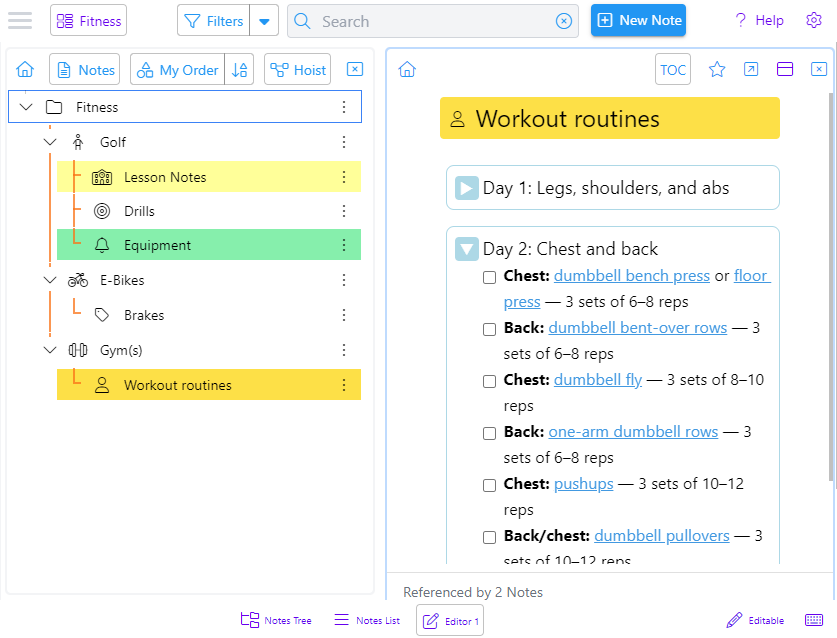
The screenshot above shows the Notes Tree and a note opened in an editor. Background colors have been removed and the active panel now has a highlighted border.

Clibu Notes on an iPhone

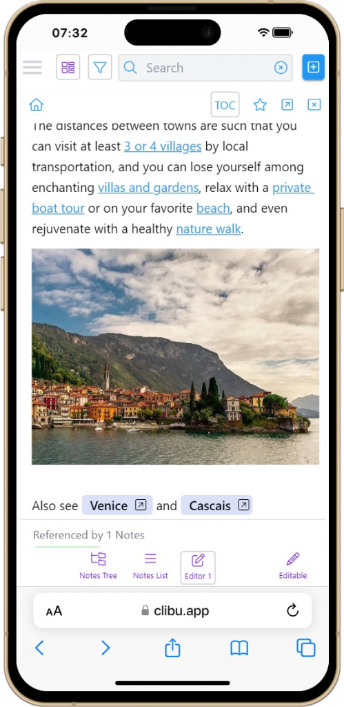
This is Clibu Notes V0.80.060 on an iPhone showing an editor panel.

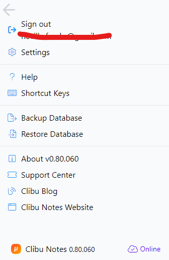
The new hamburger button opens this panel with items moved from the Settings menu and navigation bars.

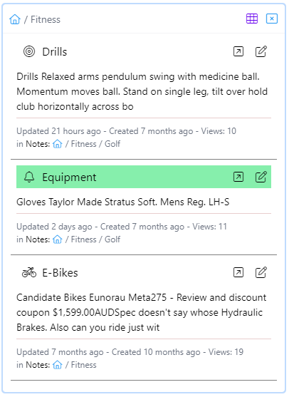
The notes list/grid also has a new cleaner look and now includes brief note content. Both it and the notes tree panel can now be closed and are reopened using the bottom navigation bar buttons.

Grid view is available on wider screens. The grid/list toggle button is hidden when grid view is not available.

In V0.80 we’ve started using a new styling (CSS) library. We’ve moved from a using ad hoc colors and styles to a standardized set. This is fundamental to the new look and feel. We’re most of the way there, but still have more to do.

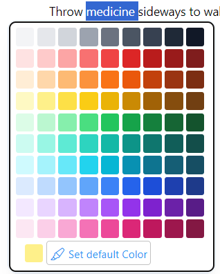
A related change is a new enhanced color picker with a much broader choice of colors.

In addition to all of these look and feel improvements we continue to fix issues we find and our users inform us about. And of course enhancements and new features are ongoing.

As you can see this is an important new Clibu Notes release and moves it closer to Version 1.

As always I look forward to your feedback.

– Neville info@clibu.com Follow us on X

Clibu V2.01.00 Improved color picker, Tab drag & drop, new article styling …

Today we’ve released Clibu V2.01.00 with some nice new UI enhancements and improved article look and feel.

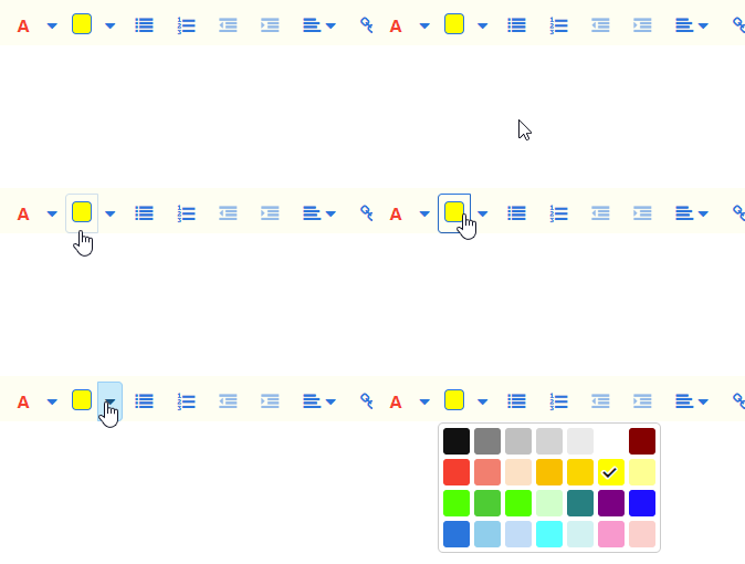
The text and highlight color pickers have been updated with more colors along with a better choice of colors for each task.

We’ve also made it quicker and easier to highlight text by splitting the buttons in two. Clicking on the left part of the button uses the current color on the selected text and clicking on the drop-down arrow lets you choose a color from the color picker.

The updates to the Color picker are important and will enable us to use it in other areas, such as setting Tags tree item colors etc.

When you have lots of Knowledge Bases open, arranging their Tabs in a specific order can be very useful. To accomplish this hold the mouse or your finger (on touch devices) down on the Tab menu icon and drag the Tab to the new location, then release it.

You will also see that we’ve changed the styling of article text along with a change to the default font. Headings styles are the main improvement, giving articles a much more modern look and feel.

Keyboard Help is back. Press Shift+? or click on the Keyboard button on the icon sidebar.

The indicator which displays when an article is loading has been updated to an animated bar, which is less intrusive and looks way better.

An issue with Knowledge Base Sharing Permissions has been fixed enabling them to be changed again.

The Clibu Web Clipper was updated in the last release, which we didn’t blog about at the time.

As always we welcome and look forward to your feedback.

– Neville


Clibu V2.00.20 Released, Performance improvements etc.

In today’s Clibu V2.00.20 release you will see Articles display more quickly following an extensive rewrite of the code that handles article display. This affects both the Article and Articles List panels.

Whenever you do a query, we now start by displaying the full Article first and then follow this by updating the Articles List. We also retrieve all the articles for the current page of ‘articles list results’ in one batch, whereas previously we retrieved them in sequence, one after the other.

Going to any Page of results in the Articles List is quicker now.

Prior to this release, the articles list could display an article from the wrong page, when you scrolled rapidly through a large number of articles, using Ctrl+Up/Dn Arrow. This has also been addressed in the rewrite.

We continue to improve Clibu’s usability by minimizing changes to what you see and are working with, when articles are moved to or from Trash or to another Knowledge Base. These include articles moved by another user. In essence we try and maintain the current Articles List and Article views to reduce the impact on your workflow.

We’ll be addressing this further in the case of adding articles, whether by you or another user, via the Web Clipper or Email, in a future release.

The ‘On Premise’ version of Clibu has also been brought up to date and a new release is now available. Contact us though the Help & Support Center for details.

For a full list of changes see the Release Notes.

– Neville


New Article Tags menu, enhanced Tabs and more in Clibu V2.00.19

Time got away from us, causing us to miss Blog posts for Clibu V2.00.15 and V2.00.16 which were both released back in March. Both were primarily fixes for various small issues. V2.00.17 and 2.00.18 were internal releases and here we are now with V2.00.19 with a longish list of updates.

New in this release is the Article Tags menu, which opens when you click/tap on a Tag in an article, as shown here.

This new menu speeds up workflow when working with tags. What’s important to note here is that all menu items except Add Tag to Article and Remove Article Tag operate on the selected tag component . So when you click on the Recipes tag, ‘Query’ will run a query on ‘Recipes’ and when you click on Middle Eastern, then Recipes is also selected and the query would be ‘Recipes/Middle Eastern’.

This is a first step in a range of enhancements to make using tags both quicker and easier.

Until now using Knowledge Base Tabs could be a little frustrating, especially when the same KB was open in multiple Tabs. Because you had no idea what the actual content for a Tab was, you were forced to click each Tab until you found the one you wanted.

In this release we’ve enhanced Tabs to include the beginning of the current Articles Title in each Tab, as shown here.

This makes it so much easier to jump straight to the Tab you actually want.

As part of this enhancement we’ve reduced the size of the tab text font and set a maximum tab width, so that more tabs are visible, reducing the need to scroll tabs. The Tab dropdown menu icon has also changed.

Next we’ve updated the Articles List behaviour, so that whenever possible the current list remains unchanged. For example if you click/tap on a ‘See Also’ article link and the target article is in the articles list for the target Tab, the list will stay as is. Previously it would cleared and then include only the target article. By retaining the current context this further improves your workflow.

As part of the Smartphone and Tablet updates we got a little to clever when we managed to get our article content selection toolbar to replace the a native Copy, Paste toolbar. In doing so we prevented Paste from being used.

So in this release the native selection toolbar is displayed where you tap and the Clibu selection toolbar is displayed at the top right corner of the article, so that it can still be used.


There is a substantial list of smaller updates, enhancements and bug fixes which you can see in the Release Notes.  One I want to mention is that you should notice articles with images display faster in this release.

In the release notes for V2.00.16 I mentioned that Clibu’s error reporting has had a major update. This has proven very helpful in helping us pinpoint and fix obscure problems as we continue to improve the overall quality of the Clibu code base.

There is plenty more going on behind the scenes, however I’ll leave that for a future blog post.

– Neville

Navigate around Articles with the new Table of Contents in Clibu V2.00.14

Another shiny new Clibu update has been released. The main new feature in V2.00.14 is the ability to access a Table of Contents for each Article, select an item and position to it.

Articles can get quite long and finding what you want inside them can be more difficult than it should be. This is where the Table of Contents (TOC) is very, very useful.

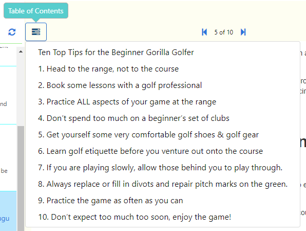
When you click/tap on the new TOC button the current article is scanned and all content that is formatted as headings is gathered and displayed in a drop down menu as shown here.

Note that the numbers 1-10 in this example are in the actual article headings.

Selecting a TOC item scrolls it into view and briefly highlights it, making moving around articles much quicker. Whilst editing the cursor is positioned at the end of the selected item.

When you open Clibu it now restores the current Article to the last article you viewed in each Tab in the previous session. This is in addition to restoring and running the last query.  So you start back exactly where you last left off.

This is something I’ve personally been wanting for a while now. It is all about workflows and getting back in the zone as effortlessly as possible.

Various issues with Clibu’s Annotations (pop up Notes) which crept into V2 have been fixed along with a few illusive, hard to track down and annoying bugs.

See the complete Release Notes for details. which you can also access from the Clibu User Menu.

– Neville

Clibu V2.00.11 Released, Quick Tour, Click to edit are back

This release brings back a few things we temporarily removed when moving from Clibu V1 to Version 2 .

First of all the Quick Tour has been updated and rejigged to work on Smartphones and Tablets. And first time users prompted to start with the Tour.

Next the ability to commence editing an article by clicking anywhere in an article is back, with a new option to enable it.

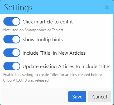
The new Click in article to edit it option is enabled by default. The reason this was removed in V2 was it gets in the way on touch screen devices, which is why the new option works on devices with a mouse (Desktop PCs), but not with Smartphones and Tablets.

We’ve also updated aspects of the Clibu Web Clipper so that the “Append Clip to Article” Browser context menu item now always uses the current article in the current Tab instead of the last selected article, which was confusing.

When “Append Clip to Article” is used and the current article is being edited, it is now taken out of edit mode so that the new content is appended correctly.

Various other issues and improvements are outlined as always in the Clibu Release Notes which you can access from the Clibu User menu or this link.

– Neville

Clibu V2.00.09, Web Clipper V2, Clibu On Premise V2 – 2018 here we come.

We’ve been very busy working on Clibu over the Christmas New Year break.  Since the initial V2.00.0 release on Dec 5. 2017 and the last Blog post we’ve released six Clibu V2 versions with a range of updates, fixes and new capabilities.

One of the more important and complex updates was moving Clibu from using insecure http to fully secure https, wss and ssl connections to the Clibu server.

We’ve also updated the Clibu Web Clipper to use https, wss so the whole Clibu stack now uses end-to-end secure connections.

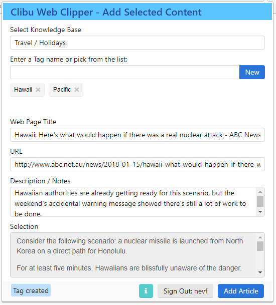
Besides enabling Web Clipper https support, we’ve updated it to match the new Clibu V2 look and feel and streamline its user interface.

The new information button displays the url of the server that the Web Clipper is  connected to. This is particular useful if you are using the ‘On Premise’ version of Clibu as you can see whether you are connected to the local On Premise server or our cloud server.

The Web Browser context menu item ‘Append Clip to Article’ shown above  now appends the selected content to the article displayed in the current Clibu KB/Tab.

If Clibu is open in multiple Browser Windows then the most recently displayed article is used for the clip. Previously the currently selected Clibu Article was used, except when the Web Clipper had created a New Article, however this was confusing. and not very intuitive.

Talking of Clibu ‘On Premise’ we’ve now completed upgrading it to Clibu Version 2, or more precisely the V2.00.09 release. So if you are using Clibu On Premise you now get all the new Clibu V2 look, feel and capabilities.

In case you haven’t heard of Clibu ‘On Premise’ it enables you to use Clibu installed on your own PC or Server with all data stored locally and completely in your control. See Clibu – Install and Run Locally for details.

For complete release notes either click on the Clibu User menu and select ‘Release Notes’ or click here.

I think you’ll agree we are off to a good start for 2018 with lots more to come.

All the best for the year ahead.

– Neville

Clibu Version 2, Easier to use and better looking with Smartphone & Tablet support. Pt 1

I’m very pleased to announce the release of Clibu Version 2. This is our biggest release yet, and probably our longest  in development. We’ve changed quite a bit of the look and feel and streamlined a number of areas to enable you to get more done in less time. And as mentioned in the last blog post we now support Tablets and Smartphones as well as Desktop PC’s.

With Clibu V2 we are delivering the same functionality across all devices unlike some applications that provide a sub-set of capabilities on mobile devices, often greatly reducing their overall usefulness.

And because Clibu V2 is a Progressive Web Application it looks, feels and works the same way across all devices. And there are other benefits, for example when the Desktop version gets a new feature, so do the Tablet and Smartphone versions. This happens without you needing to update applications, nor waiting for App Stores to approve new releases.

There is a lot to talk about with this release, which I’ll do over several blog posts.

Let’s start with some screen shots.

This shows the list of all Articles for the ‘Sample’ Knowledge Base. ‘Tag or Text Search’ enables you to filter the list to show just the articles you are interested in.

The three icons in the left icon bar switch between the Knowledge Base, Tags Tree and Articles list panels.

Tap any article in the list to show it or tap the back arrow or swipe left to close the sidebar panel.

Here you see the article selected in the Articles List above. You can edit the article by tapping the green pencil button.

Swipe right to slide open the side panel or tap the hamburger menu at top left.

Tabs switch between open Knowledge Bases, Search and access to the User menu are all located above the article.

This shows the sidebar panel with the Tags Tree selected and the Tag item menu open. From here you can show just the articles for a selected tag, and perform the full set of Tags management functions, such as Add, Rename, Delete, Move etc.

‘Search’ is available on the top bar of each panel and takes you to the Query panel shown above. The new Query panel/dialog is another major update in Clibu V2 and enables both full text search and tags queries in the one convenient place.

When the Query is blank a history list of the most recent full text search as well as the most recently queried tags is displayed. When you start typing the list is filtered to only display matching search history items and tags tree items , as shown above. The icon beside each list item indicates whether it is a text search or tag item.

To perform  a new full text search, type in the search text and either tap ‘Search’ or press Enter. Otherwise tap on a list item to search for it.

That covers quite a bit of ground for Clibu V2 on Smartphones. The user interface for Tablets is essentially the same.

Of course with Tablets we have more screen space available, to put to good use. With the benefit of Clibu V2s responsive design, we are able to optimize the user experience for each device you run it on. Including changes from landscape to portrait mode.

Following along with the user interface changes for Smartphones and Tablets, the Desktop or PC UI has also been improved quite a lot. There are still three independent cascading sidebar panels for Knowledge Base, Tags and Articles unlike the single sidebar on smaller devices. Search has been unified into a single dialog which is much easier to use (see above).

One thing we have done is tone down the use of bold colors to make Clibu easier on the eye. Better looking Tabs, simpler buttons and a generally cleaner look mean Clibu is now more aesthetically pleasing and snappier. More on the Desktop changes in a future blog post.

We still have some issues to resolve on iOS/iPad/iPhone, whose Webkit Browser is unfortunately more challenging to deal with than other Browsers.

And for our Desktop users we’ve temporarily removed the  Quick Tour and Keyboard Help which will reappear in due course.

That’s all for this first Clibu V2 blog post. If you tried earlier versions of Clibu and it didn’t excite you, do give V2 a good workout and let us know what you think. And of course we want to hear from our current users as well.

– Neville

PS. See Clibu V2 Release Notes