As soon as you open Clibu V1 you will see a much cleaner, easier and quicker to use, user interface. I was never happy with the original Clibu design which had bits modelled on Surfulater, however it failed to match Surfulaters ease of use in one area, and that was selecting a specific article. This was because Surfulater included a list of article titles, which you could select from and Clibu didn’t. Clibu followed other aspects of Surfulater, such as displaying the full content of all matching articles.
To try and remedy these underlying issues I’d included the ability to collapse articles so you could browse through a list and select one. Then I added a second collapsed summary view so you could see more articles at once and finally I added a button that would hide all matching articles, except the current one. All the while none of this felt right, Clibu was getting clunkier to use, not easier and I was continually thinking something better was needed.
After much reflection and looking around at other apps, particularly on tablets and mobile where so much is happening now, I eventually came up with what you see in V1 and I have to say that for the first time I’m really pleased with how Clibu now works.
Clibu now consists of three collapsible panels and one fixed panel. These are as follows:
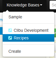
- Knowledge Bases – Lets you select and open KB’s and lets you create a KB.
- Tags – Displays the hierarchical Tags Tree where you can select a Tag to show only articles that match it, rename, move, create tags etc.
- Article List – Displays a short overview of each matching article, and enables you to select the full article content, star the article, move it to trash etc.
- Full Article – This displays an entire article, with full editing capabilities.
This animated screenshot shows the three panels collapsing and expanding.
 The new button bar on the left enables you to collapse and expand each panel. Keyboard shortcuts are also available. The keyboard help button has moved to the bottom of the button bar (not shown here).
The + button in the Knowledge Base and Tags panels are used to create new KB’s and Tags. You’ll see several new icons and buttons in this release, hover over any one to see a tip about what it does.
Of course the Tab Bar is still present and lets you switch between the Knowledge Bases you have open. You will see the Tags Filter has moved up to to top navigation bar, alongside search.
As well as making Clibu easier to use I’ve taken this as an opportunity to freshen it’s look, with toolbars and icons that are softer and more subtle in appearance.
Another big step forward in V1 is that Clibu now works quite well on touch devices, in particular Tablets. So far most testing has been done using Chrome on Android and to a lesser extent Safari on iOS on iPad. There is still more we need to do, however it is really nice to be able to use Clibu on Tablets now.
Smaller screen smart phone support is still a work in progress. Needless to say squeezing an application like Clibu on to small screens and getting a touch user interface working effectively is challenging.
One thing to note re. touch in Clibu V1 is that you can now use a long touch for certain actions. A long touch on a button or icon displays a tip about what it does and a long touch on items with a drop-down menu opens the menu, for example on a Tag in the Tags Tree or on a Tab.
The new collapsible panel design and changes to the top navigation bar all tie in closely with making Clibu usable on Tablets etc.
In addition to the new user interface and look we’ve made some significant changes under the hood, which I’ll discuss in a future blog post.
In the meantime I hope you’ll find Clibu V1 an important step in making it your go to tool to collect and access information and look forward to your feedback.

