Today we’ve released Clibu V2.01.00 with some nice new UI enhancements and improved article look and feel.
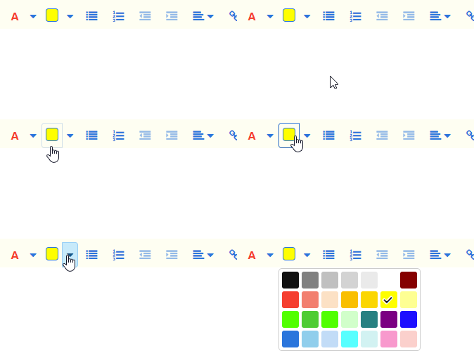
The text and highlight color pickers have been updated with more colors along with a better choice of colors for each task.
We’ve also made it quicker and easier to highlight text by splitting the buttons in two. Clicking on the left part of the button uses the current color on the selected text and clicking on the drop-down arrow lets you choose a color from the color picker.

The updates to the Color picker are important and will enable us to use it in other areas, such as setting Tags tree item colors etc.
When you have lots of Knowledge Bases open, arranging their Tabs in a specific order can be very useful. To accomplish this hold the mouse or your finger (on touch devices) down on the Tab menu icon and drag the Tab to the new location, then release it.

You will also see that we’ve changed the styling of article text along with a change to the default font. Headings styles are the main improvement, giving articles a much more modern look and feel.
Keyboard Help is back. Press Shift+? or click on the Keyboard button on the icon sidebar.
The indicator which displays when an article is loading has been updated to an animated bar, which is less intrusive and looks way better.
An issue with Knowledge Base Sharing Permissions has been fixed enabling them to be changed again.
The Clibu Web Clipper was updated in the last release, which we didn’t blog about at the time.
As always we welcome and look forward to your feedback.
– Neville
