Sample Clibu ToDo App with our new Tree

The second release of our new Tree Widget is now online with more new capabilities demonstrated via. a sample ToDo Application.

The UI has been further refined and now adheres to the W3C Web Accessibility Guidelines.

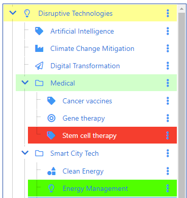
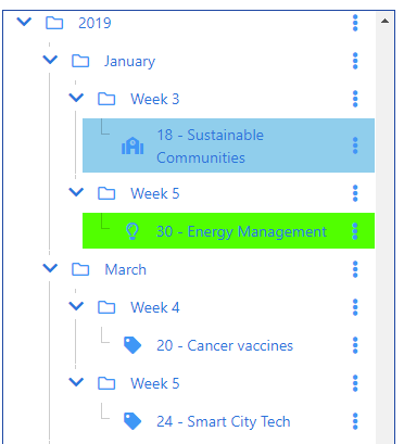
Tree Filters are the number one addition in this release.

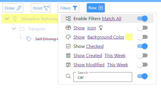
Filters enable you to see and work with specific sets of tree items. In the example above only items that include the word car and whose checkbox is checked are displayed.

Ascendant items which don’t match the filter are also displayed, however they are dimmed to visually differentiate them.  You can filter by any or all of the items displayed in the screen shot by clicking on Match All.

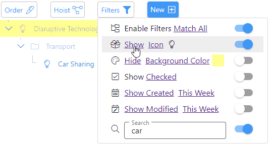
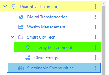
Icon, Background Color, Date Created and Date Modified can inverted to Hide items that match, as shown here.

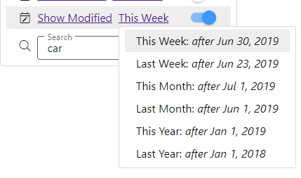
Date Created and Date Modified filters enable you to select from various date ranges.

The Filter button icon changes to a solid color when filters are on.

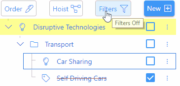
A long press on the filter button is an alternative to using the Filters menu to toggle filters off/on as shown above.

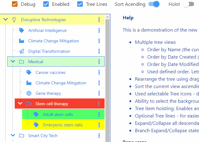
Another new feature in this release are tree item checkboxes. When checked the text changes to strikethrough. Any descendants also toggle their checkbox state. The Show Checked/Unchecked filter shows or hides checked items.

Next we’ve enhanced the Order menu to enable each view to have its own independent sort order.

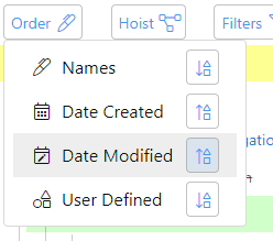
Taping the sort button reverses the order for that view.

When Hoisting is active the Hoist button icon changes to a solid color and the tree background color changes.

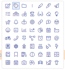
The palette of icons has increased in this release and all icons have been changed to a lighter outline.

The icon for the selected tree item is highlighted menu the icon picker opens. Likewise for the color picker.

Finally the Settings menu has been added.

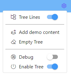
The last two menu items are only shown when the application is in debug mode.

As part of the work on accessibility, we’ve implemented comprehensive keyboard support, which also conforms to the accessibility guidelines.

For example the cursor arrow keys navigate the tree and all menus. Tab and Shift Tab move within tree and menu items setting focus on user interface elements, to enable further actions to be taken. Space toggles a checkbox, switch etc., Enter opens a menu associated with a button and Esc works back through previous user interface elements.

I’ve been quite surprised at how poorly most Web applications implement real keyboard support and their lack of accessibility support.

This release, like the previous release, stores all data in a database in your Browser. In the future we’ll include data synchronization across devices and full offline support.

And of course we’ll deliver an application that works on Smartphones, Tablets and the Desktop.

Unveiling our new Clibu Tree Widget

One particular area in Clibu that I’ve not been satisfied with is the Tags Tree, which lacked functionality and was even a step backwards from Clibu’s predecessor, Surfulater. It has shortcomings which make working with the tree more difficult than it need be and it is missing niceties which enhance its usefulness.

So I went back to square one, specified all the requirements I felt were both mandatory and also the ones that would improve its overall usability.  At the same time I took this as an opportunity to reevaluate the underlying code libraries I’d developed Clibu with, as so much has not only changed, but greatly improved in the last few short years.

This has been a terrific experience, one which Clibu and its users will definitely benefit from. Further, this explains why you haven’t seen any new Clibu releases in a little while, nor any activity here on the Blog.

Without further ado let’s run through the new and improved Clibu Tree Widget. First a couple of screenshots. All images are of the same tree content.

Multiple Tree Views

This is the Name View.

This is the Date Created View.

New capabilities

  • Multiple tree views give you different insights:
    • Order by Name (the current Clibu view)
    • Order by Date Created (tree displays, year, month, week, day – tree item(s))
    • Order by Date Modified (tree displays, year, month, week, day – tree item(s))
    • Used defined order. Lets you order siblings (items at the same tree level)  however you want.
  • Rearrange the tree using drag and drop.
  • Sort the current view ascending/descending.
  • Used selectable Tree Icons – displayed to the left of the tree item name.
  • Ability to select the background color for each tree row.
  • Tree item hoisting. Enables any tree item to become the root or top-level item in the tree.
  • Optional Tree lines – for easier tree visualization.
  • Expand/Collapse all descendants.
  • Branch Expand/Collapse state persists across sessions.

Drag and Drop

The ability to rearrange the tree using drag and drop is one of the big improvements, along with different views of the tree.

As you drag a tree item it’s background color changes to green when it can be dropped. If it can’t be dropped a notification is displayed underneath it explaining the reason why as shown here.

When dropping in between items an arrowed line shows the drop location. It is green when the drop is valid and grey when it isn’t.

One view of special note is where you can arrange tree items in any order you want, not just sorted by name.

This shows moving ‘Sustainable Communities’ before ‘Energy Management’. In the Demo this is the byUserDefined view. Switching back to the byName view will display the tree sorted in name order.

Tree Hoisting

Next we’ve added Tree Hoisting which changes the view to show only the selected tree item along with all of its descendants. Hoisting enables you to work on a subset of the tree, in isolation from the tree as a whole.

The Hoist switch instantly toggles back and forth between the hoisted view and the full tree view.

Sort Order

Continuing with tree views is the ability to sort the tree either in ascending or descending order. This works for all tree views.

Highlighting Tree Items

To make specific tree items more prominent you can set their background color and icon.

Etc.

Other nice features include the ability to display tree lines which make it easier to see the shape of the tree. Expand and collapse entire branches with the expand/collapse state maintained independently for each view and retained across sessions.

Demonstration App

We’ve put together a Demonstration app for you to play with. All data is stored in a database in your Browser. There are Demo usage instructions on the app web page.

The Debug checkbox enables us to view any issues that may occur along with some of the app’s inner workings. If an error occurs two additional panels will be displayed, one showing the database and the other the tree. Please send us a screenshot if these are displayed.

The end or just the beginning

The new tree delivers important functionality which will help streamline your use of Clibu. Functionality we’ve developed for the tree, like drag and drop, will over time be incorporated into more parts of Clibu as our journey of continual improvement unfolds.

I hope you like what you see and as always your feedback is greatly appreciated. Please use the comments section below for all feedback including any bug reports.