Hierarchical Tags in Clibu Notes V0.90.000

A thorough implementation of Hierarchical Tags is now available in the latest Clibu Notes release. This is an important milestone which moves us much closer to a Version 1 release. It is also the biggest release of late and even though we’d planned for Hierarchical Tags from the start, it was more complex task and took longer than we’d estimated.

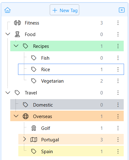
That said I’m very pleased with our tags implementation, which delivers enhanced tag functionality, such as the ability to set the color of a tag and an icon. These attributes are used both in the Tags tree and Tags in Notes, making it easier to visually locate tags.

The new Tags Tree also includes a count of notes associated with each tag.

Tags Tree

This shows tags in notes using the attributes set in the tree. Clicking on a tag in a note selects that tag in the Tags tree which then shows the notes that include that tag in the matches panel.

You can rearrange tags in the tree using drag and drop or cut and paste. All changes are immediately reflected in tags in notes. And of course tags can be renamed.

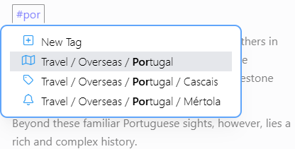
To add a tag to a note type a # followed by the tag text. A list of matches lets you quickly pick an existing tag or create a new one.

As we start to get feedback on how you are using Tags I can envisage changes being made. I already have some ideas for improvements. So please do let us know any suggestions you may have.

Hierarchical Tags provide an alternate method to organize and locate groups of related notes. They build on functionality provided by the Notes Tree and Backlinks.

For more information see Tags in the Clibu Notes Help and in the V0.90.000 Release Notes

– Neville

Markdown – what’s not to like?

We recently added Export to Markdown to Clibu Notes to enable you to use your notes in other applications. This led to a deeper dive into Markdown than I expected.

What follows is information I gleaned during this process.

Formatting text

Markdown is used in Note taking applications to enter formatted text (italic, bold etc) and as a file storage method.

When you have a full keyboard available, text entry may be quicker for operations which might otherwise require a toolbar button click. ie. You have to use a mouse or touchpad vs typing markdown formatting characters.

Many formatting commands are available using Ctrl/Cmd+someKey which can be as performant as markdown. For example Ctrl+I vs * for italic text.

Some applications like Clibu Notes convert markdown into wysiwyg within the editor itself, others have a separate panel to render the wysiwyg content.

Downsides

Markdown has extensions and different flavours. However it’s capabilities are fixed. For example the Details – Summary block in Clibu Notes has no equivalent in Markdown.

The only workaround for this, that I’m aware of, is to embed HTML within the Markdown.

Whether this works across different applications is debatable. It also means one of the reasons for using markdown, that is they are simply plain text files, becomes obscured.

See Workarounds for things not officially supported by Markdown.

Markdown files are just Text Files

Plain text files stored in the operating system is definitely a win. It means these files are not necessarily tied to the application that created them.

They can be edited and viewed in other applications. Although editing them in other applications might not be prudent.

And they can outlive the application that created them.

Once again there are some downsides.

Because note titles are used for markdown filenames (.md files) certain characters cannot be used in titles. ex. <>:”/\|?* This can be annoying and shouldn’t impact your use of titles, but it does.

Filenames must be unique amongst their siblings, so you can’t have two notes with the same title in the same folder.

Filenames are limited in length on some operating systems, so therefore are titles.

In Clibu Notes, Folders are notes. ie. They contain content just like any other note. In an operating system, folders are containers for files and can’t have content. So the folders in Markdown based applications can’t contain content.

This means when you Export to Markdown in Clibu Notes we have to create separate files to contain each folders note content.

Files vs a Structured Database

We’ve stated the benefits of using plain text files above, however PKM applications deal with structured data. Let me explain.

Many PKM applications enable you to organize notes in a tree. This mimics how files are organized in an operating system. So notes in your Markdown PKM are stored as files in folders to match your tree. All good so far.

When you move a note in your tree the Markdown PKM app needs to move the file on disk to it’s new folder. That’s fine, however it now needs to update each and every note (file) that references the note you moved.

How does it even know which notes (files) reference the note that was moved. I’ll assume it builds some sort of index when it starts.

Tree’s are just one way of organizing notes. We typically have back links which link two articles together, tags which reference a set of notes and possibly other mechanisms.

So now we are dealing with what can become quite complex structured data.

Let’s compare this to a PKM application that is built from the ground up to work with structured data.

When you move a note in the tree in Clibu Notes, the only change is to relocate the note item in the tree (data structure) to its new location. We don’t need to locate and update the notes that reference the note that was moved, nor do we need to update the note itself.

To accomplish this, every note is created with a unique identifier that never changes. References to other notes use these identifiers. Whether they be in the tree or are backlinks.

This is way more efficient and robust than moving and updating physical files. It is also fundamental to enabling reliable and correct synchronisation of all content, both offline and online across devices.

In essence Clibu Notes uses and relies on database principles to efficiently and robustly manage your notes.

But what about data obsolescence

Ok so to meet the objective of your Clibu Notes content outliving the Clibu Notes application we provide Export to Markdown. This enable you to move your notes to another PKM that supports Markdown. No one wants vendor lock in of their content.

The before times

Before we added Export to Markdown: Titles could use any characters, be any length and be duplicated. Sadly those days a gone.

Travel shouldn’t stop you working

Travel shouldn’t hinder your ability to work. In fact this article was started on my Desktop PC, with some background information. Then I made some updates on my Phone while travelling to the Airport for an Interstate trip last week.

The entire article was written on the plane (no Internet) using my Chromebook. Upon landing and getting back online all changes synchronized to my phone. When I returned to my office and turned on my PC, it updated with all the changes made in the air. Now I am now doing a few final edits ready to publish.

Can you travel and work this seamlessly with your current PKM?

Have a great week, Neville

PS. If your looking to try a Note Taking / PKM app that is simple and effective, sign up for access to Clibu Notes today – all it costs is your time.

More new releases, more improvements

On average we’ve been putting out new Clibu Notes releases twice a week for the past few months. These typically include a mix of new and updated capabilities along with bug fixes. See the Release Notes for full details.

As we get more people using Clibu Notes, more issues come to the surface. I’m pleased to say the turn around time to resolve a problem and release an update is typically just a couple of days.

We also proactively monitor for issues and often times the user isn’t even aware that something may not have quite worked as expected.

I’ve recently been asked whether this monitoring includes any access to users content and the answer is absolutely not. We get details of whereabouts in the code an error occurred, what may have caused it, the email address of the user and the type of device, operating system and browser being used.

We’ve also been improving and optimizing the user experience across devices. The way we use applications on Smartphones, Tablets and Desktop PCs differ considerably and we need to adapt applications to meet the needs and work within the constraints of each device.

Delivering a good user experience on Smartphones with their small screens and virtual keyboard is the most challenging and I feel we are doing a pretty well. That said we are continually looking at ways to make Clibu Notes easier to use.

To that end we’ve recently added the optional blank like toolbar: Blank line toolbar

When you have a physical keyboard it is easy to tap / to open the Slash commands menu. This is not the case with the virtual keyboard on a Smartphone, where you may need two or more taps to use / and another tap or two to return to the normal keyboard.

This is where the blank line toolbar comes to the fore, providing similar functionality as the Slash menu, without having to perform keyboard gymnastics. The blank line toolbar is enabled by default on Smartphones and can be enabled or disabled on the Settings menu.

On the topic of Smartphones we’ve worked hard at improving the usability of Clibu Notes on Apple’s iOS. Until Apply implements viewport updates when the virtual keyboard opens & closes we remain hamstrung. This has been on Apple’s list for well over a year now and hopefully we’ll see it sooner than later.

As an aside Clibu Notes works wonderfully well on Chrome on Android and also installed as a PWA. See the Clibu Notes Help for “Installation” details and “Share from other applications”.

That’s if for this post.

– Have a great week, Neville – Author of Clibu Notes

Personal Knowledge Management: Why It’s Essential for Your Success

In today’s fast-paced world, we are exposed to a plethora of information on a daily basis. As a result, it’s vital to have an effective system for managing knowledge that enables individuals to find information easily, recall it when necessary, and apply it to their work or life in the most effective way. This process is called personal knowledge management (PKM).

What is Personal Knowledge Management?

Personal knowledge management is the process of collecting, organizing, and analyzing information to enhance one’s understanding of a subject or topic. In simpler terms, it’s about how we store, retrieve, and use the knowledge we gain through various sources like web sites, books, articles, videos, or conversations. It allows individuals to create their own personal library of knowledge, making continuous learning and development possible.

Why is PKM important?

  1. Efficiency: Personal knowledge management enables us to access information quickly and efficiently. A well-organized system of knowledge allows us to retrieve information without wasting time, leading to better productivity.
  2. Innovation: Innovation requires a deep understanding of technology and the market it operates in. By continually organizing and reviewing our knowledge base, we can understand trends and identify new ideas and opportunities.
  3. Career Advancement: Employers want individuals who are not just knowledgeable about their field, but also show initiative to stay current and apply their knowledge effectively. PKM allows professionals to maintain a competitive edge and advance in their careers.
  4. Lifelong Learning: Personal knowledge management is an enabling factor for continuous learning. It allows individuals to acquire new knowledge, retain it, and enrich their understanding of the world around them.

How to Develop an Effective PKM Strategy

  1. Identify your goals: Determine the areas of knowledge you want to acquire or improve upon. Identify your strengths and weaknesses, and set goals accordingly.
  2. Gather information: Curate information from various sources, including books, articles, podcasts, and videos, related to the topics of interest.
  3. Organize your knowledge: Organize the information into categories or themes using tools like Evernote, OneNote, or Trello. Create tags, labels, and folders to find information quickly and easily.
  4. Review regularly: Review your knowledge base regularly and update it with new information. Reflect on your learnings, synthesize your takeaways, and apply them efficiently in your work or life.
  5. Share your knowledge: Share your knowledge with others through social media, blogs, or speaking engagements, to create new connections and gain insights from others.

Conclusion

In today’s data-heavy world, personal knowledge management is an essential skill for those who want to be better learners, innovative thinkers, and effective professionals. It is an enabling strategy that allows individuals to develop and maintain a deep level of knowledge that enhances both personal and professional growth. By following the tips shared in this post, you can create a system that works for you, leading to a lifetime of success.

There are many good and not so good PKM applications, all have their strengths and weaknesses. We welcome you to evaluate our PKM, Clibu Notes and see how well it meets your needs.

Clibu Notes V0.80 new cleaner look and feel

Following on from reviews by designers and from user feedback we’ve given the Clibu Notes user interface a thorough makeover.

It now has a simpler and much cleaner look. We’ve also moved some UI components off of the main screen to a new sidebar slide out panel.

This has free’d up space, making Clibu Notes easier to use on Smartphone’s.

Clibu Notes - UI Makeover

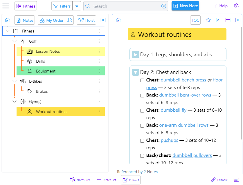
The screenshot above shows the Notes Tree and a note opened in an editor. Background colors have been removed and the active panel now has a highlighted border.

Clibu Notes on an iPhone

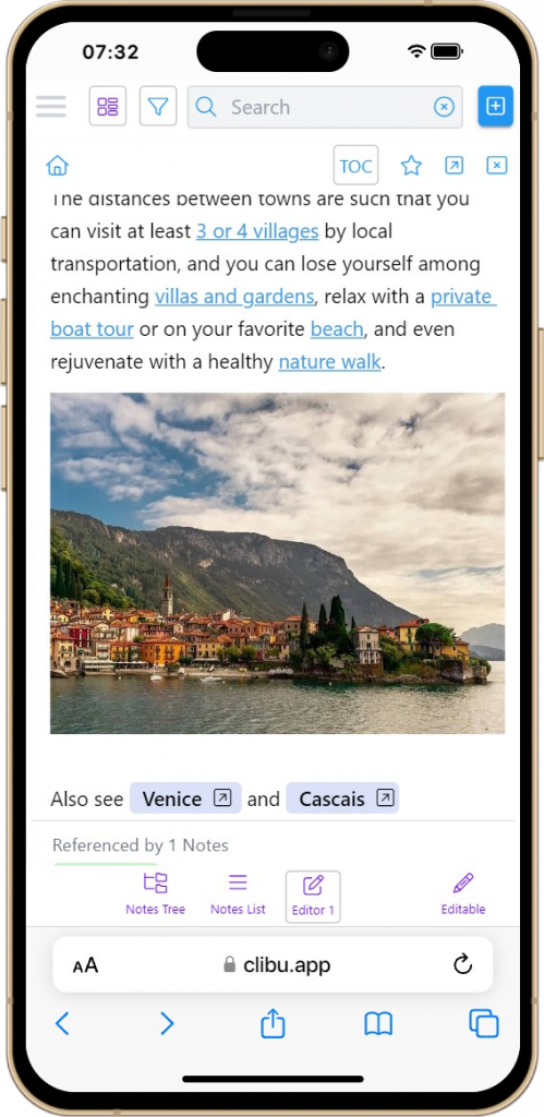
This is Clibu Notes V0.80.060 on an iPhone showing an editor panel.

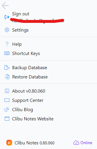
The new hamburger button opens this panel with items moved from the Settings menu and navigation bars.

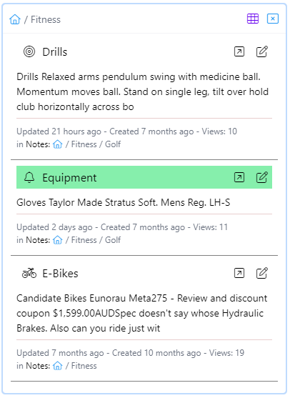
The notes list/grid also has a new cleaner look and now includes brief note content. Both it and the notes tree panel can now be closed and are reopened using the bottom navigation bar buttons.

Grid view is available on wider screens. The grid/list toggle button is hidden when grid view is not available.

In V0.80 we’ve started using a new styling (CSS) library. We’ve moved from a using ad hoc colors and styles to a standardized set. This is fundamental to the new look and feel. We’re most of the way there, but still have more to do.

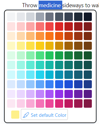
A related change is a new enhanced color picker with a much broader choice of colors.

In addition to all of these look and feel improvements we continue to fix issues we find and our users inform us about. And of course enhancements and new features are ongoing.

As you can see this is an important new Clibu Notes release and moves it closer to Version 1.

As always I look forward to your feedback.

– Neville info@clibu.com Follow us on X

Why are so many apps so complex – Part 2

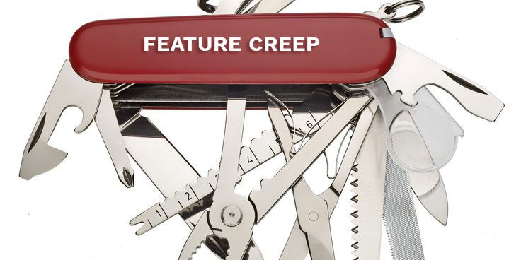
Feature Creep

Continued from Part 1

I want to start with a small rant. One fairly common user interface action that irks me is having to hover over an area to reveal a hidden icon which you then tap/click to reveal a toolbar or menu. I don’t know about you but I find this awkward at best.

You randomly move your mouse around and out of the blue some icon appears and if you don’t stop at just the right moment it disappears again.

It gets even worse on touch screen devices, like your smartphone, which have no concept of mouse hover. So the designers/developers have to come up with others ways of enabling the user to perform the actions that are behind these hidden icons.

The end result is a different user experience and user interface for the very same application across different devices. Rant over.

Creatively, A publication about creativity and productivity-boosting tools.

Philipp Temmel writes a fantastic weekly newsletter named Creatively which I can highly recommend. As I’ve said to Philipp I don’t know how he is able to produce such high quality, insightful content on a weekly basis.

Creatively issue 243 is what prompted to write these two articles. My plan was to write a short intro and then with Philipp’s permission, republish the opening part of issue 243. However as I started writing Part 1 I couldn’t stop, so here we are now with Part 2.

And now with Philip’s permission the excerpt I mentioned.

Hey and welcome to Creatively 243

I am observing a trend I am following unconsciously. Over the course of the last couple of months, I simplified loads of my workflows. Based on that, I also started using new tools, got rid of some I used previously, and explored different integrations. While it all was exciting when note-taking and PKM tools introduced “self-organizing by AI” and everyone screamed at me that I do not need to use folders, tags, or anything else, it is simplicity for me to organize my notes freely, following a simple system, knowing where I can find stuff if I am looking for it. As we are evolving Scrintal, introducing new features and functionalities, we want to be sure that everyone can get started taking notes, building up a knowledge base, and managing projects. There should be no need to take a course, read through docs, guides, or tutorials. If you have a dedicated system, you should be able to apply it, but if you have no system that should not hinder you from starting out.

Nowadays, there are loads of note-taking, PKM, and productivity tools which are forcing systems on you. As those apps get packed and bloated with features, the simplicity gets lost. Back in the day, taking notes was as easy as grabbing a pen and paper. You could jot down anything you wanted, whether it was a to-do list, an important meeting point, or just a random thought that popped into your head. It was simple, effective, and didn’t require a computer science degree to figure out. But then technology came along and disrupted everything. Suddenly, there were all these fancy note-taking apps that promised to revolutionize our lives. And sure, they did bring some cool features to the table. You could now organize your notes in different categories, add tags, and even sync everything across devices. It was like having a personal assistant in your pocket.

But here’s the thing: these apps got so caught up in trying to be the best, they forgot about the one thing that truly mattered – simplicity. They became bloated with unnecessary features, confusing menus, and an absurd number of customization options. Suddenly, taking a simple note turned into a complicated task that required a user manual. The same thing happened with PKM apps. They started off as a promising way to manage our personal knowledge, allowing us to store articles, links, and ideas in one place. It was like having an external brain to rely on. But then the developers decided to throw in a bunch of additional features – smart filters, complex search algorithms, and even machine learning. Suddenly, managing our knowledge became a PhD-level task.

And don’t even get me started on productivity apps. They used to be all about helping us stay organized and get things done. But now they bombard us with notifications, reminders, and all sorts of time-tracking features. It’s like they’re constantly breathing down our necks, making us feel guilty for not being productive every second of the day.

As of recently, I have the feeling that simplicity is making a comeback. Users are starting to realize that they don’t need all these complicated apps to be productive. They’re looking for tools that are intuitive, easy to use, and don’t require a steep learning curve. In the end, simplicity is not about dumbing things down or removing features. It’s about understanding what truly makes a tool useful and optimizing it for a seamless user experience.

This really resonates with me and the landscape I see. I encourage you to visit Creatively and Sign Up for the newsletter.

That’s it until next time.

Neville

PS. Follow us at X on Medium and on LinkedIn.

Why are so many apps so complex – Part 1

Feature Creep

Developing software to meet the diverse needs of a broad range of users is hard. You are continually be pulled in different directions and can eastly find yourself adding features your noisiest users want, only to find you’ve just complicated things for 90% of your users in order to satisfy that 10%.

Learn to say no

Designing software that is easy to use and delivers the functionality that the majority of your best users need is as much a craft as it is a science. As I recently posted on X, it is often times too easy to add a new feature (especially if you love writing code) and much harder to sit back, carefully weigh up the pros and cons and then conclude it is better not to add this feature, documenting the reasons why.

If you don’t carefully and thoughtfully follow this process you will most likely end up with a bloated, overly complex and hard to maintain application that may well be attractive to a small group of power users but not so the wider community. This could easily impinge on the success and longevity of the product.

Say no early and beware of hype cycles

Once you’ve built an application and have lots of users it can be extremely difficult to remove features or some would say cripple it. So you need to cull unnecessary features as early on as possible, or better still never include them.

With all the recent hype about AI, many applications have added some level of AI, so they get to join the AI hype bandwagon. In one case I’m aware of they’ve moved so heavily into AI that the app has morphed into something so different that the users are far from happy.

Experience counts

Having years of experience building user facing applications has made it easier for me to say no to creeping featuritis, code bloat and unnecessary complexity.

Having said that, every day I’m still learning and hopefully improving. In fact if I was to start Clibu Notes development today their are some user interface aspects I would do differently. Hindsight is such a wonderful thing.

Iterate and improve

Clibu Notes is our third generation of Note Taking application, each one a complete redesign and rewrite from the ground up. We started with a Windows only Desktop app, then a Cloud only Web app and now with Clibu Notes an application that works online in the cloud as well as completely offline. It can be installed like any native application on Windows, Mac, iOS, Android and Linux and also works in the Browser.

With each generation we’ve refined the user interface and we’ve made some quite major changes along the way. Each time the goal has been to try and further simplify the application and at the same time make it more useful.

Be current & take on big issues

To deliver on that premise Clibu Notes works across all of your devices, whether online or offline, merges all changes automagically and has the same clear and consistent user interface and user experience on all devices.

In my opinion many applications are stuck in an old way of software development. Separate apps are built for each platform, Mac, Windows etc. And often the user interface and user experience differs across platforms, especially on smartphones and tablets, assuming they support these.

Progressive Web Applications are a win win.

Progressive Web Applications (PWAs) work across all modern platforms and completely bypass having to build separate applications for each one. With a PWA you have a single unified, platform agnostic, code base which simplifies all aspects of the application.

Designing Clibu Notes as a PWA from the ground up was a clear and obvious choice. The benefits to us and our users are truly significant.

Continued in Part 2.

Neville

Aside:

I’m now publishing our Blog articles on Medium. You can subscribe to those via this link and see our articles on Medium with this link.

PS. Follow us at X on Medium and on LinkedIn.

Offline PKM has real and measurable benefits

Recently a Clibu Notes user had an issue which unfortunately caused Clibu Notes to crash. At that time we hadn’t got around to making Clibu Notes crash resistant. This quickly resulted in user emails telling me the server was down, which I was also aware of through our monitoring tools.

This brings me to the point of this post and that is no matter what happens with the Clibu Notes server (and in future your own hosted Clibu Notes server) life goes on pretty much as normal due to Clibu Notes ability to run with full functionality without an Internet connection.

Knowing that you still have full access to all of your notes and can edit them, create new notes, rearrange the tree etc. is wonderfully liberating. In the scenario above, as soon as the server was up and running again all changes were updated across all devices. Even edits of the same notes on different devices merge and are once more unified.

Online only applications

When applications only run on a remote server all work grinds to a halt when you lose your Internet connection or the server goes down for whatever reason.

Offline applications

On the other hand applications that run only locally will of course keep running, but these typically don’t have the ability to seamlessly merge changes or enable concurrent editing of content on multiple devices or by multiple users.

Clibu Notes – the best of both online and offline

It is clear to me that if you want the peace of mind knowing your content is always available, can always be updated and added to across all of your devices, regardless of whether you are connected to the Internet or not then applications with the level off offline support Clibu Notes has are a must.

You can check how applications you maybe using compare with Clibu Notes offline functionality with the following:

Works without
Internet
Collaborative
Editing
Devices update in realtime*Awareness
Offline OnlyYesNoNoNo
Offline + SyncYesNo (1)No (2)No
OnlineNoNo (3)MaybeMaybe
Clibu NotesYesYes (4)Yes (5)Yes

* Awareness shows you other users/devices who are online, where they are editing and what changes they have made.

1) Edits on different devices will typically overwrite each other, losing content.
2) Synchronizing changes for offline apps is unlikely to be fine grained and and make take some time.
3) Unlikely to support real collaborative editing of the same content at the same time. Similar issue to (1).
4) The same note can be edited by any user on any device and all changes will eventually coalesce to the same content. This is regardless of whether a user is online or not.
5) When online, otherwise as soon as they go online.

Eventually consistent content

In order to update all changes from all users whether they were made offline or online, we need code the appears to work like magic. This includes edits to exactly the same content on different devices.

We get this magic from CRDT’s or Conflict-free Replicated Data Types. Discussing CRDT’s here is well beyond the scope of the article, however I can highly recommend a series of articles by Jake Lazaroff, starting with An Interactive Intro to CRDTs.

Conclusion

If you want to be able to access all of your notes, add new notes and edit notes on your Smartphone, Tablet or Desktop PC wherever you are, whether you have an Internet connection or not, then Clibu Notes is the solution you need.

PS. Clibu Notes is now Crash resilient. This means that if there is a serious issue which takes the server down it will automatically restart.

PPS. Clibu Notes V0.72.030 has just been released, and continues our steady stream of new releases. See the Release Notes in the Help for details.

How I use Clibu Notes

I’ve been asked to provide some information on how I use Clibu Notes on a day to day basis. Hopefully this article will help you get some ideas to fit into your note taking workflow, whether you are using Clibu Notes or a similar Knowledge Management application.

I use Clibu Notes for several purposes.

Research

Research is one important area. When I invest time in researching an area of particular interest, I want to ensure that what I’ve found is retained and readily accessible. The last thing I want is to have to do the same painstaking research all over again.

This might be about recommended places to visit for a future trip, detailed information I need to keep for specific development work on software projects such as Clibu Notes. Or information to help improve my Golf game or Fitness and maintaining a happy and healthy life.

Find it once, keep it forever and access it anywhere. You get the idea.

Research

Project Tracking

Next is tracking the work I’m doing. What new features am I considering, how useful are they to the broader community, how much will they cost to implement, can they be justified and what priority are they given.

When a new feature is in development I also track it’s progress, and ensure Help and other documentation is written for it.

Then there is a need to track bugs, usability and other issues.

I also track and keep notes on work around the house and things that need to be done.

Project Tacking

Planning

We like to travel, especially overseas and these trips take considerable planning. This something I do with my wife, so we share and collaborate on the various tasks. It is a combination of research and detailed checklists.

These tend to be intense periods of work which happen infrequently and are very important to us.

Planning

Experiences

When we’ve been to a nice restaurant, drank a bottle of wine we particularly like, visited an unusual and interesting place, we keep notes so we can remember to enjoy these again at some point.

Notes of places we’ve taken for trip planning will find their way here for the ones that stand out. Often times the memories you bring back home are as important as the original visit.

Trees and Work Spaces

In the examples above I’ve shown how I organize my notes using Clibu’s Notes Tree. However not everyone wants to organize their notes in a hierarchy and Clibu Notes in no way forces you to. You can even hide the tree, so you never see it.

For those of you who prefer a flat structure I recommend having a set of top level tree items to organize your notes into collections. This will enable you create (Work) Spaces for each collection.

Spaces enable you to segment the tree and focus on a single branch of notes.

When a space is selected the tree and notes list/grid only shows notes in that that space. Search and Filters are restricted to notes in the space. You can still open linked notes, which are outside the current space.

Nitty Gritty

In order to produce notes that function well for me I make heavy use of backlinks, which enable me to navigate between related notes. Note icons and colors to visually locate notes. Search and less so Filters to drill down to specific sets of notes. I use the My Order view along with drag and drop to arrange the tree just how I want it. And Date views to see notes in a timeline. Spaces to segment the tree into actionable work areas.

A Note with Links, Backlinks & Collapsed blocks

When editing I use a mix of markdown and toolbar functionality for text formatting. Task lists, well for tasks. Drag and drop to reorder lists, block select & move to reorder blocks, details for collapsible blocks and text highlighting. I typically have two note editors open.

I’ll Archive notes that I want to keep, but that are no longer of interest in the context of my current day to day work.

Smartphones & Tablets

On my phone and tablets Clibu Notes is installed as a Progressive Web App (PWA) and added to the home screen. A single tap then opens it. When I’m primarily consuming content, I’ll tap the Editable icon on the bottom bar to prevent any accidental changes.

Using Clibu Notes to take short notes on my phone is very convenient. I’ll typically flesh them out when I’m back on a device with a physical keyboard.

Knowing that Clibu Notes automagically synchronizes changes down to the character level, across all devices is and I’ll repeat magically liberating. Along with the ability to work offline, which is a must in todays mobile world.

Note on Smartphone + Search

To finish up

There are no hard and fast rules about how you use a PKM app like Clibu Notes. Different people have very different ideas about what works best for them and ways of accomplishing that.

You need to sit down and work through your requirements and then see if you can find an application that meets those criteria, or at least comes close.

Think about how you want to structure and organize your notes, but don’t stress over it. Your PKM of choice should make it easy to restructure and reorganize your notes, as the need arises and as you and it grow together.

Unfortunately a common trait is to spend too much time and effort organizing notes. Think more about note retrieval – how can I quickly locate a specific note or set of notes and the notes that are related to them. What tools does my PKM provide to assist in fast and accurate note retrieval.

There are plenty of Youtube videos on organizing notes. Some are focused on specific applications and others more generic or focusing on a methodology. 

Tiago Forte is quite prolific in this area. This is a new video on his PARA method. A methodology called the Zettelkasten method has received quite a bit of attention the last few years.

The ways that people are using PKM’s is exploding in much the same way that PKM applications are.

I hope you’ve gleamed something useful from this article. Please do leave a comment below and follow us on Twitter (now X)

And if you haven’t signed up to use Clibu Notes yet, please do give it a try. We’d love to get your feedback.

– Neville

Clibu Notes: Your data, stored locally, available on all your devices.

There has been a move for some time now, which continues to gather pace where people don’t want their data in the cloud on some large companies servers where they have no idea who might be looking at it or profiting from it.

My background was developing Windows Desktop software where everything was stored on your PC and you copied files around from PC to PC as needed.  Cumbersome and fraught with missteps which could easily leave you in a pickle.

After many years of doing Desktop software I moved to Web Application development where data was stored on servers under my control and could be accessed from any device effortlessly.

For Knowledge Base applications like our original Clibu App this meant users could access and update information anywhere they had access to a Web Browser and the Internet.

So far so good. However obstacles still remain. First some folks don’t want their data stored in the cloud, second cloud only applications are useless if you don’t have an Internet connection or the cloud server is down and third is what happens if the company hosting your app and cloud data goes out of business.

For Clibu we tackled these issues by releasing Clibu On Premise, a version that you install locally. However this meant the ability to access your data from anywhere on the planet was lost, unless you had the wherewithal to setup and configure secure  remote access. Another downside is we needed to keep our cloud version and on-premise versions in step, which created more work for us and meant on-premise sometimes fell behind.

So what’s the solution. Well we’ve learnt an awful lot developing Clibu, which was our first serious Web Application. Over that time Browser capabilities have improved a lot, often quite dramatically.

This has led us to rethink Clibu from the ground up, how it could function to deliver the best possible end user experience. One where all data is kept on your local device, where it can be accessed without any Internet connection, where the application continues to work should we go out of business or stop development, where data is automatically shared and synchronized across all devices on your local Network and where you can optionally access it from any Browser anywhere if you enable your data to be kept on a central server.

Given we can meet all of these objectives I think you’ll agree this paints a very good picture. You own your data, it is kept on your devices and optionally on a central server either run by us in the cloud or on PC of your own (on the roadmap).

This is all very timely as others are on this same journey. I can recommend reading Local-First Software: You Own Your Data, in spite of the Cloud and a shorter easier to read related article by Adrian Colyer – Local-first software: you own your data, in spite of the cloud from his daily newsletter.

To quote the articles above:

Great local-first software should have seven key properties.

  1. It should be fast.

  2. It should work across multiple devices.

  3. It should work without a network.

  4. It should support collaboration.

  5. It should support data access for all time.

  6. It should be secure and private by default.

  7. It should give the user full ownership and control of their data.

So how does the new Clibu Notes app rate on these criteria. The good news is we tick all of these boxes.

I could be that I’m overly optimistic as:

… we speculate that web apps will never be able to provide all the local-first properties we are looking for, due to the fundamental thin-client nature of the platform. By choosing to build a web app, you are choosing the path of data belonging to you and your company, not to your users.

I don’t see the issue here. The data for a web app that can run entirely locally belongs to the users.

What is a real issue with offline use where you still want online access from any device anywhere, is the accumulation of changes made to your data over time. To be precise in order for users to collaborate and work offline, every change to every bit of data must be retained, potentially for ever.

Quote:

Performance and memory/disk usage quickly became a problem because CRDTs store all history, including character-by-character text edits. These pile up, but can’t be easily truncated because it’s impossible to know when someone might reconnect to your shared document after six months away and need to merge changes from that point forward.

To handle this ever increasing memory/disk usage some sensible controls can be put in place. For example if you know that worst case any one user maybe offline for a month, then when they come back online you can cleanup up the accumulated data for all users. Or if you know who all the users are and all of the devices they use,  then you can cleanup when they are all online or you can notify them they might lose their local changes if they don’t get back online within a certain time. Best practices here will evolve over time.

So where are we now

Clibu Notes can and does work entirely offline. You can use Clibu Notes in your Web Browser or Install it as an application on Desktop, Tablet and Smartphone.

When you are online, all updates are synchronized in real time with all  instances of Clibu Notes you have open and online. When an offline instance of Clibu Notes goes Online it will synchronize all of its offline changes with all changes made by other online instances. These changes are fine grained down to the character level in notes. In other words edits to a note in multiple copies of Clibu Notes whether online or offline will merge and resolve the changes so the note is identical on all devices.

Just as edited notes are eventually consistent so are changes to the shape of the Notes Tree, note icons and colors. And finally Work Spaces are also kept consistent. Simply put it doesn’t get any better than this.

As stated on the Clibu Notes website. knowing that your notes and associated data is automagically kept up to date across all of your devices is Magically liberating.

If you haven’t signed up for free access to Clibu Notes go and do it now. How well does it meet your needs? We’d love to know.

– Neville