How I use Clibu Notes

I’ve been asked to provide some information on how I use Clibu Notes on a day to day basis. Hopefully this article will help you get some ideas to fit into your note taking workflow, whether you are using Clibu Notes or a similar Knowledge Management application.

I use Clibu Notes for several purposes.

Research

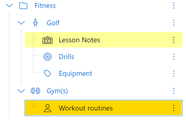
Research is one important area. When I invest time in researching an area of particular interest, I want to ensure that what I’ve found is retained and readily accessible. The last thing I want is to have to do the same painstaking research all over again.

This might be about recommended places to visit for a future trip, detailed information I need to keep for specific development work on software projects such as Clibu Notes. Or information to help improve my Golf game or Fitness and maintaining a happy and healthy life.

Find it once, keep it forever and access it anywhere. You get the idea.
Research

Project Tracking

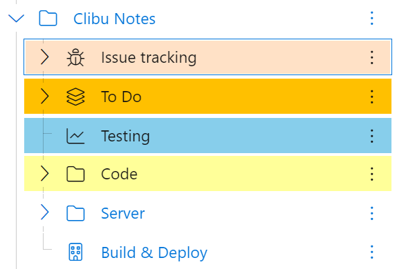
Next is tracking the work I’m doing. What new features am I considering, how useful are they to the broader community, how much will they cost to implement, can they be justified and what priority are they given.

When a new feature is in development I also track it’s progress, and ensure Help and other documentation is written for it.

Then there is a need to track bugs, usability and other issues.

I also track and keep notes on work around the house and things that need to be done.
Project Tacking

Planning

We like to travel, especially overseas and these trips take considerable planning. This something I do with my wife, so we share and collaborate on the various tasks. It is a combination of research and detailed checklists.

These tend to be intense periods of work which happen infrequently and are very important to us.

Planning

Experiences

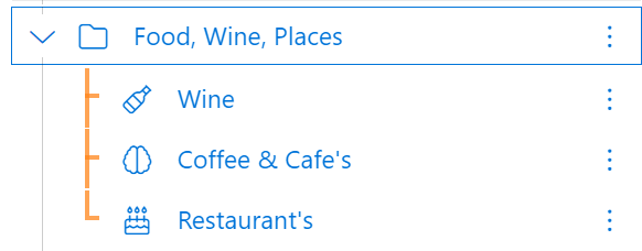
When we’ve been to a nice restaurant, drank a bottle of wine we particularly like, visited an unusual and interesting place, we keep notes so we can remember to enjoy these again at some point.

Notes of places we’ve taken for trip planning will find their way here for the ones that stand out. Often times the memories you bring back home are as important as the original visit.
Trees and Work Spaces

In the examples above I’ve shown how I organize my notes using Clibu’s Notes Tree. However not everyone wants to organize their notes in a hierarchy and Clibu Notes in no way forces you to. You can even hide the tree, so you never see it.

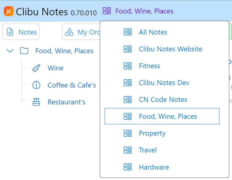
For those of you who prefer a flat structure I recommend having a set of top level tree items to organize your notes into collections. This will enable you create (Work) Spaces for each collection.

Spaces enable you to segment the tree and focus on a single branch of notes.

When a space is selected the tree and notes list/grid only shows notes in that that space. Search and Filters are restricted to notes in the space. You can still open linked notes, which are outside the current space.
Nitty Gritty

In order to produce notes that function well for me I make heavy use of backlinks, which enable me to navigate between related notes. Note icons and colors to visually locate notes. Search and less so Filters to drill down to specific sets of notes. I use the My Order view along with drag and drop to arrange the tree just how I want it. And Date views to see notes in a timeline. Spaces to segment the tree into actionable work areas.
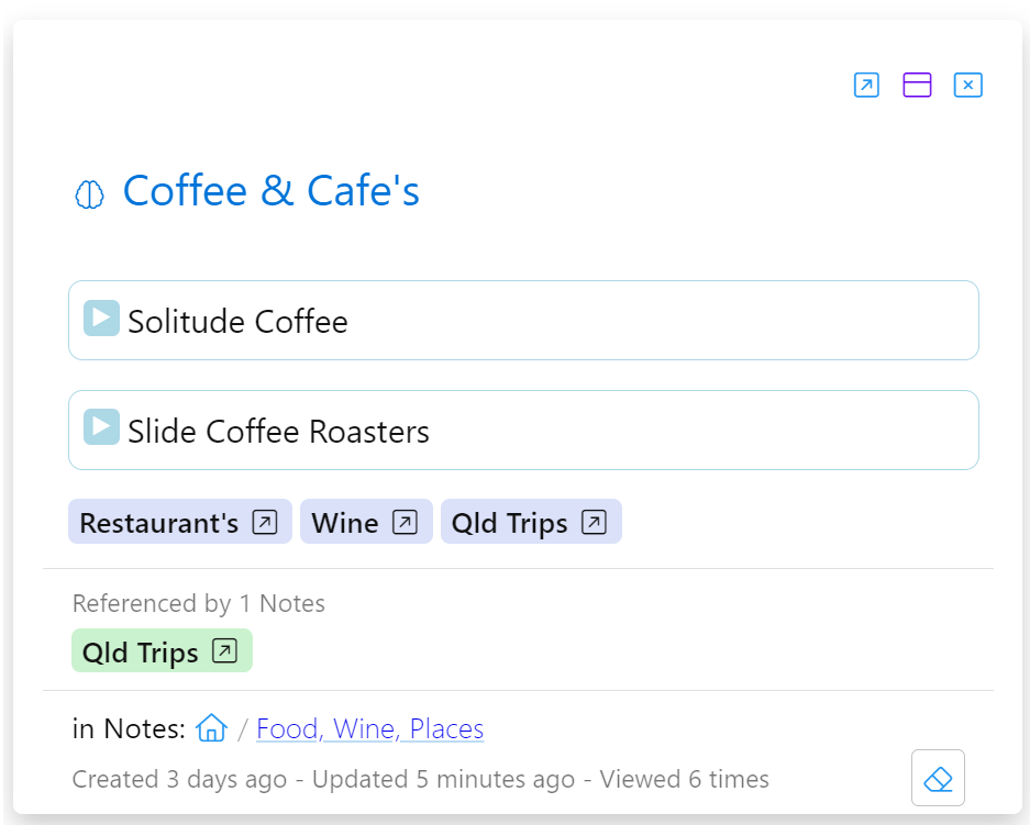
A Note with Links, Backlinks & Collapsed blocks

When editing I use a mix of markdown and toolbar functionality for text formatting. Task lists, well for tasks. Drag and drop to reorder lists, block select & move to reorder blocks, details for collapsible blocks and text highlighting. I typically have two note editors open.

I’ll Archive notes that I want to keep, but that are no longer of interest in the context of my current day to day work.

Smartphones & Tablets

On my phone and tablets Clibu Notes is installed as a Progressive Web App (PWA) and added to the home screen. A single tap then opens it. When I’m primarily consuming content, I’ll tap the Editable icon on the bottom bar to prevent any accidental changes.

Using Clibu Notes to take short notes on my phone is very convenient. I’ll typically flesh them out when I’m back on a device with a physical keyboard.

Knowing that Clibu Notes automagically synchronizes changes down to the character level, across all devices is and I’ll repeat magically liberating. Along with the ability to work offline, which is a must in todays mobile world.
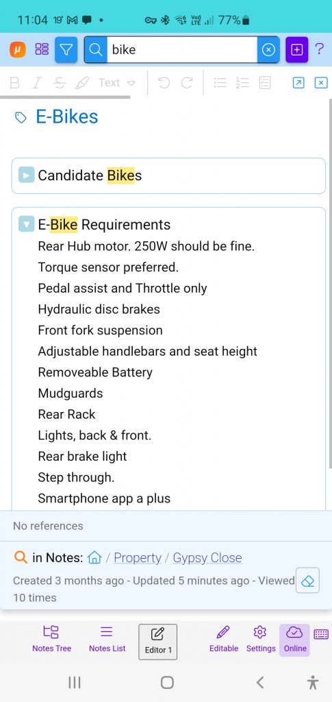
Note on Smartphone + Search

To finish up

There are no hard and fast rules about how you use a PKM app like Clibu Notes. Different people have very different ideas about what works best for them and ways of accomplishing that.

You need to sit down and work through your requirements and then see if you can find an application that meets those criteria, or at least comes close.

Think about how you want to structure and organize your notes, but don’t stress over it. Your PKM of choice should make it easy to restructure and reorganize your notes, as the need arises and as you and it grow together.

Unfortunately a common trait is to spend too much time and effort organizing notes. Think more about note retrieval – how can I quickly locate a specific note or set of notes and the notes that are related to them. What tools does my PKM provide to assist in fast and accurate note retrieval.

There are plenty of Youtube videos on organizing notes. Some are focused on specific applications and others more generic or focusing on a methodology. 

Tiago Forte is quite prolific in this area. This is a new video on his PARA method. A methodology called the Zettelkasten method has received quite a bit of attention the last few years.

The ways that people are using PKM’s is exploding in much the same way that PKM applications are.

I hope you’ve gleamed something useful from this article. Please do leave a comment below and follow us on Twitter (now X)

And if you haven’t signed up to use Clibu Notes yet, please do give it a try. We’d love to get your feedback.

– Neville

Clibu Version 2, Easier to use and better looking with Smartphone & Tablet support. Pt 1

I’m very pleased to announce the release of Clibu Version 2. This is our biggest release yet, and probably our longest  in development. We’ve changed quite a bit of the look and feel and streamlined a number of areas to enable you to get more done in less time. And as mentioned in the last blog post we now support Tablets and Smartphones as well as Desktop PC’s.

With Clibu V2 we are delivering the same functionality across all devices unlike some applications that provide a sub-set of capabilities on mobile devices, often greatly reducing their overall usefulness.

And because Clibu V2 is a Progressive Web Application it looks, feels and works the same way across all devices. And there are other benefits, for example when the Desktop version gets a new feature, so do the Tablet and Smartphone versions. This happens without you needing to update applications, nor waiting for App Stores to approve new releases.

There is a lot to talk about with this release, which I’ll do over several blog posts.

Let’s start with some screen shots.

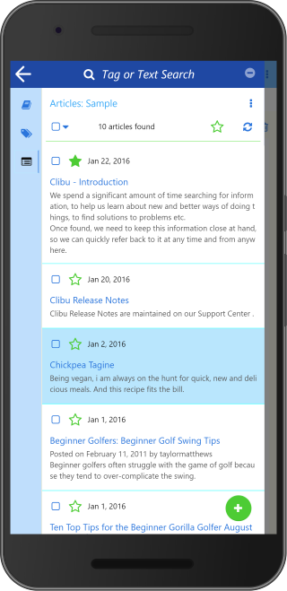
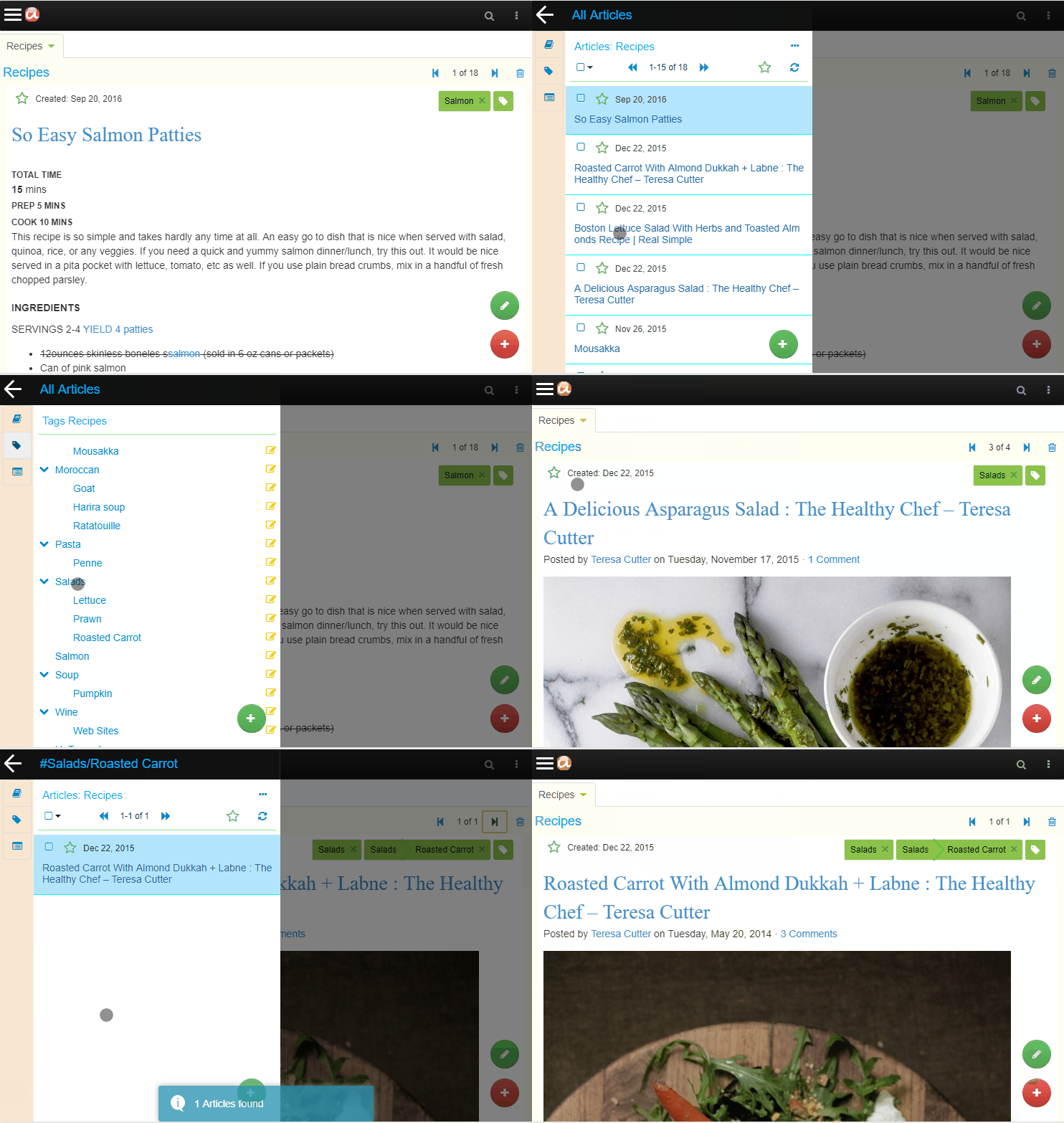
This shows the list of all Articles for the ‘Sample’ Knowledge Base. ‘Tag or Text Search’ enables you to filter the list to show just the articles you are interested in.

The three icons in the left icon bar switch between the Knowledge Base, Tags Tree and Articles list panels.

Tap any article in the list to show it or tap the back arrow or swipe left to close the sidebar panel.

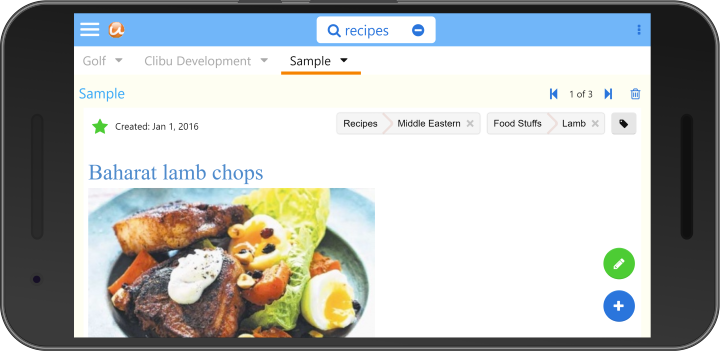
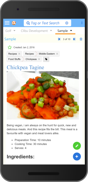
Here you see the article selected in the Articles List above. You can edit the article by tapping the green pencil button.

Swipe right to slide open the side panel or tap the hamburger menu at top left.

Tabs switch between open Knowledge Bases, Search and access to the User menu are all located above the article.

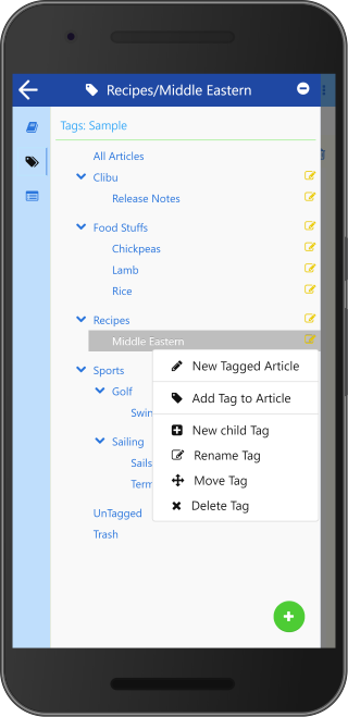
This shows the sidebar panel with the Tags Tree selected and the Tag item menu open. From here you can show just the articles for a selected tag, and perform the full set of Tags management functions, such as Add, Rename, Delete, Move etc.

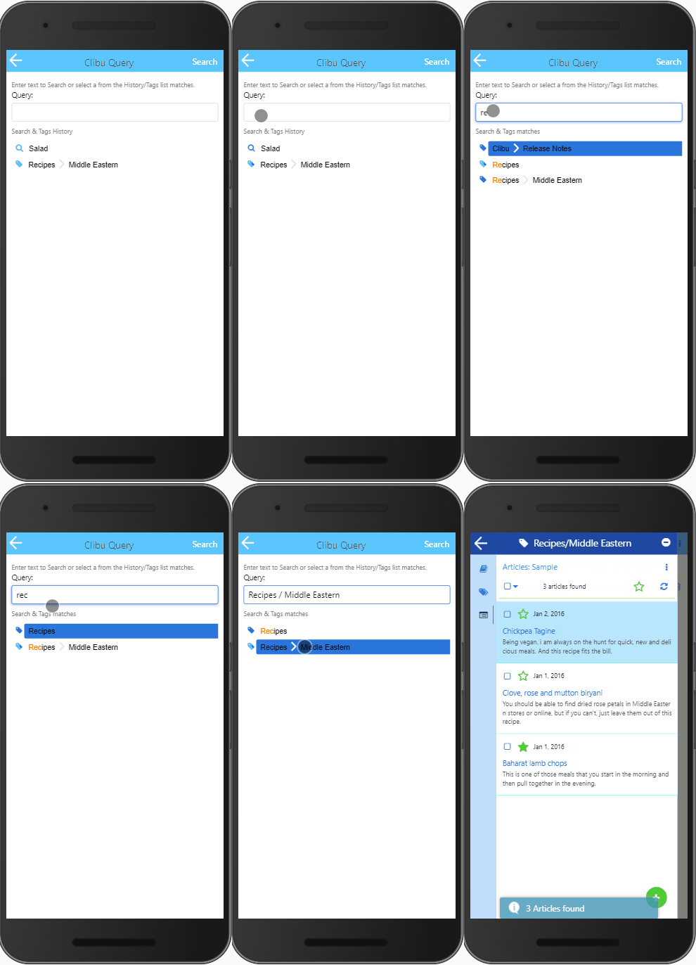
‘Search’ is available on the top bar of each panel and takes you to the Query panel shown above. The new Query panel/dialog is another major update in Clibu V2 and enables both full text search and tags queries in the one convenient place.

When the Query is blank a history list of the most recent full text search as well as the most recently queried tags is displayed. When you start typing the list is filtered to only display matching search history items and tags tree items , as shown above. The icon beside each list item indicates whether it is a text search or tag item.

To perform  a new full text search, type in the search text and either tap ‘Search’ or press Enter. Otherwise tap on a list item to search for it.

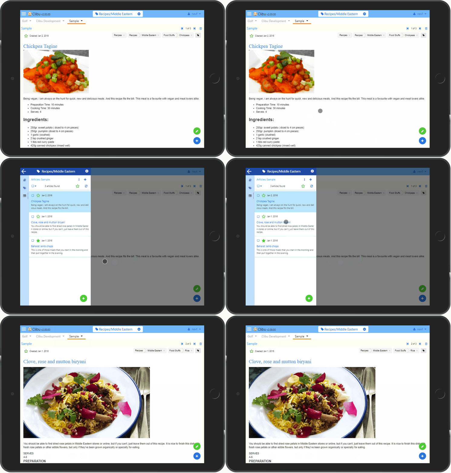
That covers quite a bit of ground for Clibu V2 on Smartphones. The user interface for Tablets is essentially the same.

Of course with Tablets we have more screen space available, to put to good use. With the benefit of Clibu V2s responsive design, we are able to optimize the user experience for each device you run it on. Including changes from landscape to portrait mode.

Following along with the user interface changes for Smartphones and Tablets, the Desktop or PC UI has also been improved quite a lot. There are still three independent cascading sidebar panels for Knowledge Base, Tags and Articles unlike the single sidebar on smaller devices. Search has been unified into a single dialog which is much easier to use (see above).

One thing we have done is tone down the use of bold colors to make Clibu easier on the eye. Better looking Tabs, simpler buttons and a generally cleaner look mean Clibu is now more aesthetically pleasing and snappier. More on the Desktop changes in a future blog post.

We still have some issues to resolve on iOS/iPad/iPhone, whose Webkit Browser is unfortunately more challenging to deal with than other Browsers.

And for our Desktop users we’ve temporarily removed the  Quick Tour and Keyboard Help which will reappear in due course.

That’s all for this first Clibu V2 blog post. If you tried earlier versions of Clibu and it didn’t excite you, do give V2 a good workout and let us know what you think. And of course we want to hear from our current users as well.

– Neville

PS. See Clibu V2 Release Notes

Clibu for Smartphones and Tablets is on its way

Our focus with Clibu’s development has been to get it working well on Desktop Web Browsers. Then once we reached that goal we’d move onto providing a full featured Smartphone and Tablet experience.  And that’s precisely what we’ve been working these past few months.

In fact we’ve gone beyond our initial plan and have begun comprehensively updating Clibu to transform it into a Progressive Web Application.

This enables Clibu to automatically adjust its user interface and functionality to run on any screen size from small smartphones, to tablets to desktops, giving you all of Clibu’s capabilities on any device.

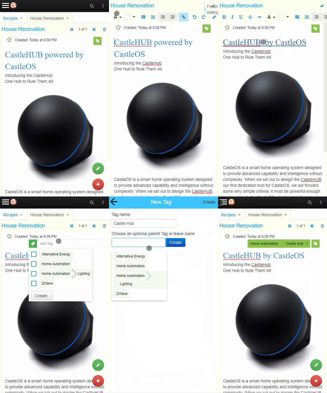
This animation shows Clibu on a tablet. You will notice the hamburger menu button at the top left and slide out panel typical on mobile applications.

The top navigation bar has changed and instead of three separate side panels from the Desktop user interface, there is a single panel which changes between Knowledge Base, Tags and Articles.

Apart from what you can see here, nearly all of Clibu’s user interface has been updated to work effectively and efficiently on small screens, while retaining all the Clibu’s functionality you are used to on your Desktop Web Browser.

Next you can see Clibu on a Smartphone. The article editor toolbar changes to occupy a single scrollable row, minimizing screen space. You can also see new round buttons to edit and add articles.

You will also notice the UI for adding a Tag has changed to use the full display area.

All of Clibu’s dialogs work this way when running on phones and tablets. And they scroll vertically to move out of the way of the on-screen keyboard.

Some further UI refinement may be needed, but overall Clibu is now very usable on our small smart devices.

In hindsight it might have been prudent to start with Mobile in mind, however a lot has changed since we started developing Clibu and supporting small screens along with all the developments in PWA’s has come a long way in the last few years.

We are most of the way through development of the next version of Clibu with smartphone and tablet support, however as you can well imagine we have a lot of testing to do, to ensure everything works correctly across devices and their various screen sizes.

We’ve been quiet on  the Blog for a little while and now you know why.

I am excited about the forthcoming release which opens up Clibu to work on all of our devices. Stay tuned.

– Neville