I’m very pleased to announce the release of Clibu Version 2. This is our biggest release yet, and probably our longest in development. We’ve changed quite a bit of the look and feel and streamlined a number of areas to enable you to get more done in less time. And as mentioned in the last blog post we now support Tablets and Smartphones as well as Desktop PC’s.
With Clibu V2 we are delivering the same functionality across all devices unlike some applications that provide a sub-set of capabilities on mobile devices, often greatly reducing their overall usefulness.
And because Clibu V2 is a Progressive Web Application it looks, feels and works the same way across all devices. And there are other benefits, for example when the Desktop version gets a new feature, so do the Tablet and Smartphone versions. This happens without you needing to update applications, nor waiting for App Stores to approve new releases.
There is a lot to talk about with this release, which I’ll do over several blog posts.
Let’s start with some screen shots.
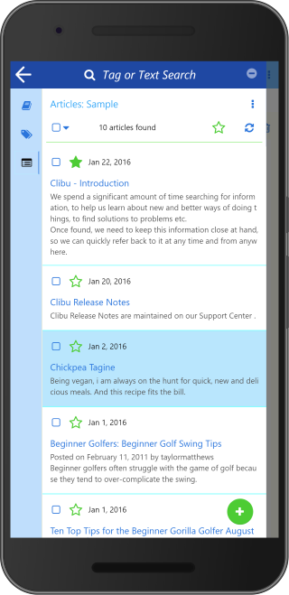
This shows the list of all Articles for the ‘Sample’ Knowledge Base. ‘Tag or Text Search’ enables you to filter the list to show just the articles you are interested in.
The three icons in the left icon bar switch between the Knowledge Base, Tags Tree and Articles list panels.
Tap any article in the list to show it or tap the back arrow or swipe left to close the sidebar panel.
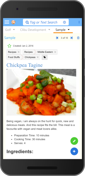
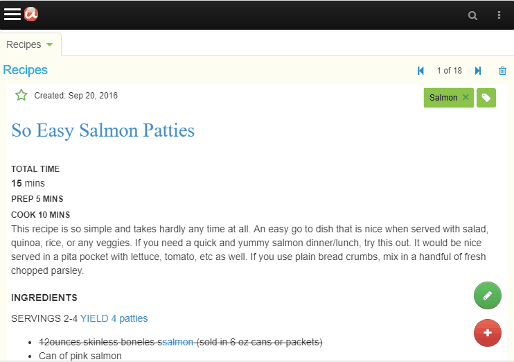
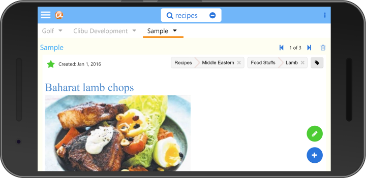
Here you see the article selected in the Articles List above. You can edit the article by tapping the green pencil button.
Swipe right to slide open the side panel or tap the hamburger menu at top left.
Tabs switch between open Knowledge Bases, Search and access to the User menu are all located above the article.
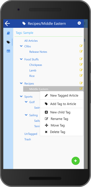
This shows the sidebar panel with the Tags Tree selected and the Tag item menu open. From here you can show just the articles for a selected tag, and perform the full set of Tags management functions, such as Add, Rename, Delete, Move etc.
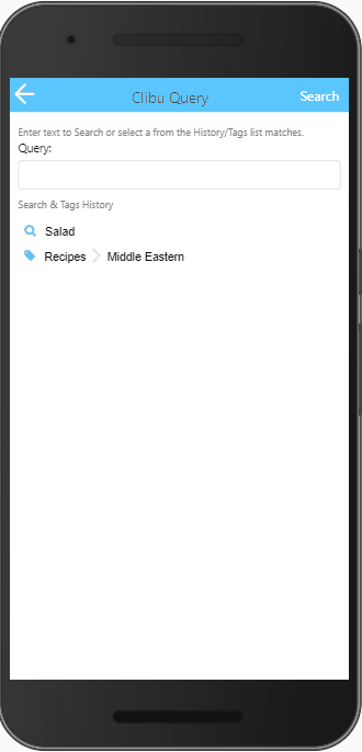
‘Search’ is available on the top bar of each panel and takes you to the Query panel shown above. The new Query panel/dialog is another major update in Clibu V2 and enables both full text search and tags queries in the one convenient place.
When the Query is blank a history list of the most recent full text search as well as the most recently queried tags is displayed. When you start typing the list is filtered to only display matching search history items and tags tree items , as shown above. The icon beside each list item indicates whether it is a text search or tag item.
To perform a new full text search, type in the search text and either tap ‘Search’ or press Enter. Otherwise tap on a list item to search for it.
That covers quite a bit of ground for Clibu V2 on Smartphones. The user interface for Tablets is essentially the same.
Of course with Tablets we have more screen space available, to put to good use. With the benefit of Clibu V2s responsive design, we are able to optimize the user experience for each device you run it on. Including changes from landscape to portrait mode.
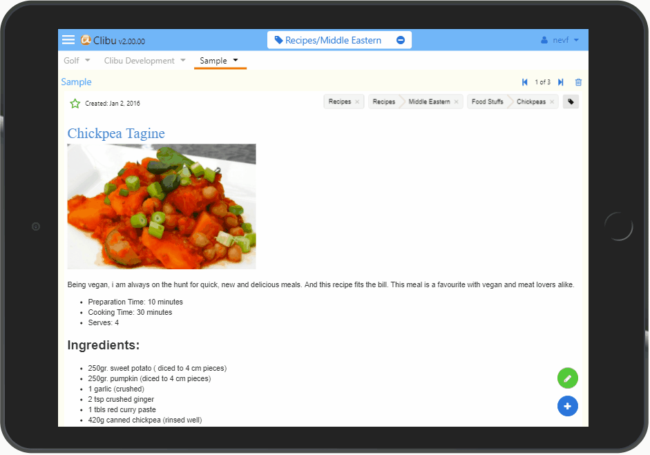
Following along with the user interface changes for Smartphones and Tablets, the Desktop or PC UI has also been improved quite a lot. There are still three independent cascading sidebar panels for Knowledge Base, Tags and Articles unlike the single sidebar on smaller devices. Search has been unified into a single dialog which is much easier to use (see above).
One thing we have done is tone down the use of bold colors to make Clibu easier on the eye. Better looking Tabs, simpler buttons and a generally cleaner look mean Clibu is now more aesthetically pleasing and snappier. More on the Desktop changes in a future blog post.
We still have some issues to resolve on iOS/iPad/iPhone, whose Webkit Browser is unfortunately more challenging to deal with than other Browsers.
And for our Desktop users we’ve temporarily removed the Quick Tour and Keyboard Help which will reappear in due course.
That’s all for this first Clibu V2 blog post. If you tried earlier versions of Clibu and it didn’t excite you, do give V2 a good workout and let us know what you think. And of course we want to hear from our current users as well.
– Neville
PS. See Clibu V2 Release Notes