Time got away from us, causing us to miss Blog posts for Clibu V2.00.15 and V2.00.16 which were both released back in March. Both were primarily fixes for various small issues. V2.00.17 and 2.00.18 were internal releases and here we are now with V2.00.19 with a longish list of updates.
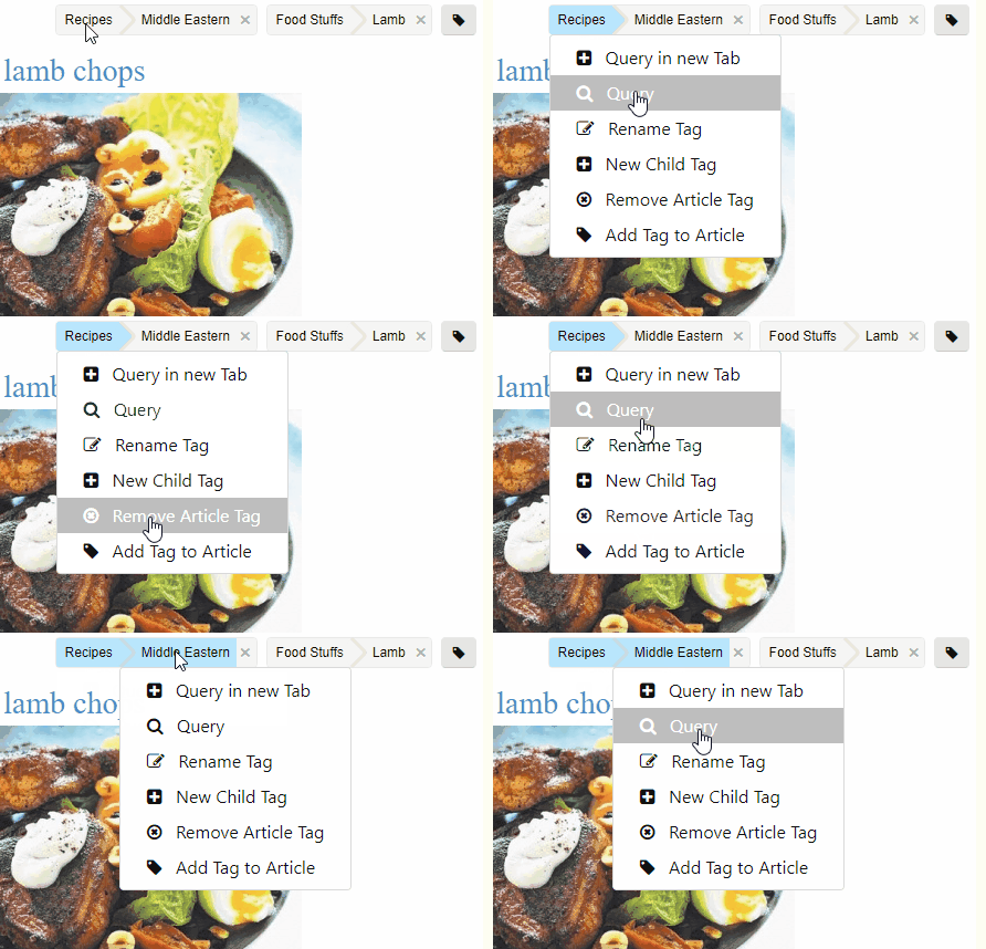
New in this release is the Article Tags menu, which opens when you click/tap on a Tag in an article, as shown here.

This new menu speeds up workflow when working with tags. What’s important to note here is that all menu items except Add Tag to Article and Remove Article Tag operate on the selected tag component . So when you click on the Recipes tag, ‘Query’ will run a query on ‘Recipes’ and when you click on Middle Eastern, then Recipes is also selected and the query would be ‘Recipes/Middle Eastern’.
This is a first step in a range of enhancements to make using tags both quicker and easier.
Until now using Knowledge Base Tabs could be a little frustrating, especially when the same KB was open in multiple Tabs. Because you had no idea what the actual content for a Tab was, you were forced to click each Tab until you found the one you wanted.
In this release we’ve enhanced Tabs to include the beginning of the current Articles Title in each Tab, as shown here.

This makes it so much easier to jump straight to the Tab you actually want.
As part of this enhancement we’ve reduced the size of the tab text font and set a maximum tab width, so that more tabs are visible, reducing the need to scroll tabs. The Tab dropdown menu icon has also changed.
Next we’ve updated the Articles List behaviour, so that whenever possible the current list remains unchanged. For example if you click/tap on a ‘See Also’ article link and the target article is in the articles list for the target Tab, the list will stay as is. Previously it would cleared and then include only the target article. By retaining the current context this further improves your workflow.
As part of the Smartphone and Tablet updates we got a little to clever when we managed to get our article content selection toolbar to replace the a native Copy, Paste toolbar. In doing so we prevented Paste from being used.
So in this release the native selection toolbar is displayed where you tap and the Clibu selection toolbar is displayed at the top right corner of the article, so that it can still be used.

There is a substantial list of smaller updates, enhancements and bug fixes which you can see in the Release Notes. One I want to mention is that you should notice articles with images display faster in this release.
In the release notes for V2.00.16 I mentioned that Clibu’s error reporting has had a major update. This has proven very helpful in helping us pinpoint and fix obscure problems as we continue to improve the overall quality of the Clibu code base.
There is plenty more going on behind the scenes, however I’ll leave that for a future blog post.
– Neville
