There are some Web pages that don’t capture all that well in Surfulater. All of the page content is captured ok, but the layout can be a mess. I’ve been building a list of such pages (and web sites) as people report them and as I come across them. For example the BBC News web site should look something like this:
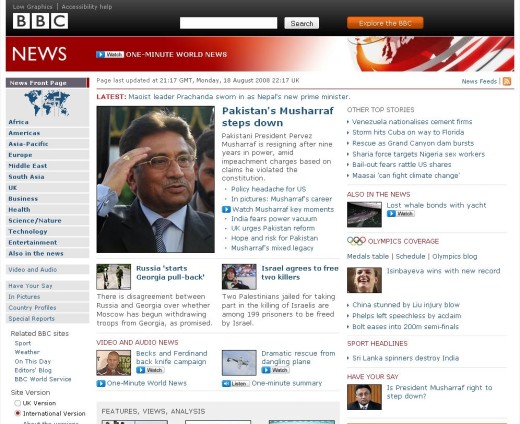
But in Surfulater Version 2.52.0.10 it looks like this:
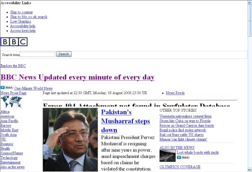
This was one of the more important issues for us to address in the forthcoming Surfulater Version 3 release. It actually turned out to be more complex and difficult to resolve than I’d expected, but the good news is Web page capture is much better now. As proof here is the same page captured in what will be Surfulater Version 3.0.
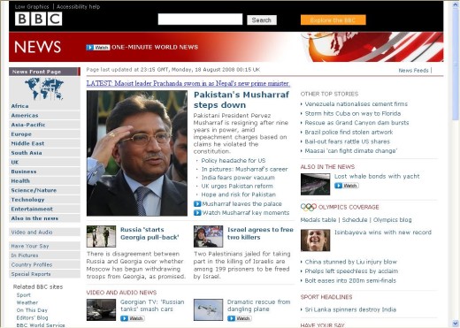
An observant person may notice one small difference to the first image, but that aside the result is very good indeed. Note that these are all full Web page captures using Surfulater: Add Article plus Page or Surfulater: Attach Page to Article and we are viewing the attached web pages.
A related content capture issue is that some Web sites prevent images from being downloaded. This shows up when capturing selected content for Surfulater articles and when capturing full web pages. This screen shot shows the problem in Version 2.52.0.10
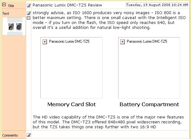
And this screen shot shows the same capture in Surfulater Version 3.0.
This proved to be another difficult issue that I am very pleased has now been resolved.
We continue to make good progress with Surfulater Version 3, with a release planned for September. I am heading up north to the Pacific for a much needed short break and to ever so briefly escape our cold winter. I look forward to wrapping up V3 upon my return, as I’m sure you all do to.
