I’m nearing the end of development for the next major Surfulater release which includes two important new features and I want to preview the first one for you now.
An enhancement that people have been asking for is to improve the visual characteristics of items displayed in the Knowledge Tree so that for example bold or italic text could be displayed, making specific tree items stand out from the crowd and therefore be easier to locate when scrolling or paging up and down.
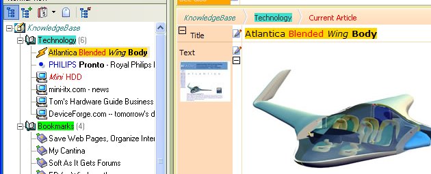
I’ve actually taken this a step further and have enabled tree items to display HTML so that what you see in the content window, is what you now see in the tree. This means text foreground and background colors along with bold and italics now appear in the Knowledge Tree.
This screen shot shows an article with its Title highlighted using background and foreground colors as well as bold and italic text and its corresponding item in the Knowledge Tree with the same visual markup applied.

I’ve also highlighted some folders and other articles. One other thing to note is the article counts to the right of each folder are now displayed in Grey instead of Black, making them a bit more subtle.
You have always been able to set the images displayed for each tree item and now with the ability to set the appearance of the text, you get full visual control of tree items. Further it lets Surfulater highlight items of specific interest, as the need arises.
Apart from our users wanting this, it was needed for the other even more important new feature coming in this release, which you will hear all about soon.

I just want to say again what a great feature tree highlighting is. Its so much easier now to find key folders in a long knowledge tree. 🙂 And the tree now looks so pretty to boot 🙂